
1.
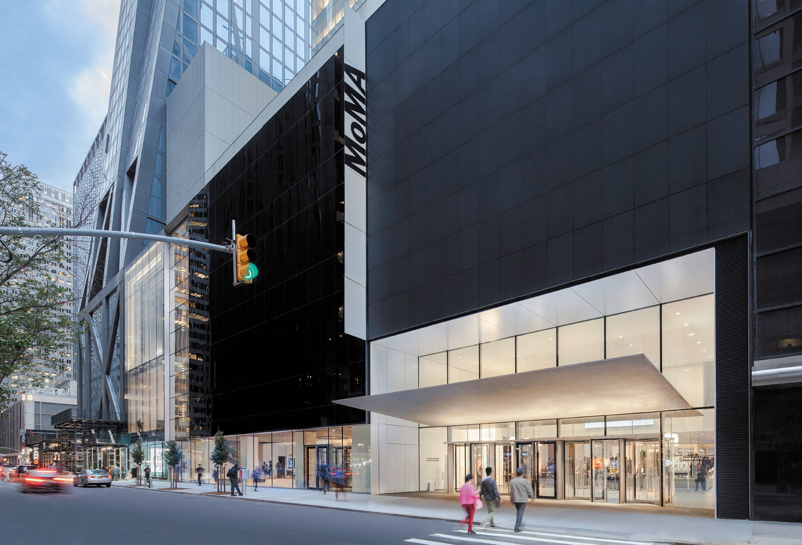
Among the plethora of disturbingly disproportionate, super-tall, super-thin condominium towers that have spiked the New York City skyline since the turn of the millennium and that graphically symbolize America’s concomitant surge in income inequality, the most recently completed of them marks the spot of the Museum of Modern Art, which inaugurated its latest building project in October, two weeks before its ninetieth anniversary. The dagger-like ultra-high-rise component of the conjoined complex was built to the plans of the French architect Jean Nouvel, while the enlargement of the museum itself is the work of the New York partnership Diller Scofidio + Renfro (DS+R) in association with Gensler, the powerhouse multinational firm that often provides technical and construction management expertise on high-style projects conceived by less full-service practitioners.
This newest architectural iteration of MoMA, which cost $450 million and is its third enlargement in little more than thirty years, was facilitated through a byzantine real estate transaction that involved complicated and costly air-rights transfers from nearby buildings (including the University Club and St. Thomas Church) to the museum, and in turn from MoMA to the property developer Hines. (This Houston-based firm realized the 1970s and 1980s corporate skyscrapers of John Burgee and Philip Johnson; the latter founded MoMA’s architecture department in 1932 and was a trustee there until his death.) The condominium tower is now—although it surely will not be for long—the seventh highest of Manhattan’s super-talls; it was first called Tour Verre, then Tower Verre, and was ultimately rebranded as the more marketable 53W53 (2006–2019). MoMA occupies its second through fifth stories, the use of which was a condition of the museum’s sale of the land beneath it to Hines for approximately $245 million (a figure confirmed by a museum spokesperson).
Nouvel’s stalagmite-shaped behemoth possesses none of the crystalline fragmentation or improbable lightness that distinguishes the finest of all slant-sided super-talls, Renzo Piano’s Shard of 2000–2013 in London (which, although thirty-four feet shorter than 53W53, is the highest building in Western Europe.) The Nouvel undertaking was made possible by Mayor Michael Bloomberg’s loosening of the city’s urban planning regulations, which had long restricted extremely tall towers to broader north–south avenues or major intersections like Fifth Avenue and 34th Street (the Empire State Building) or Lexington Avenue and 42nd Street (the Chrysler Building). The area around MoMA was already so densely overbuilt that its stretch of West 53rd Street receives very little sunlight in any season, and the museum must bear responsibility for making local environmental quality even worse with this colossal imposition.
Some commentators have attempted to draw parallels between 53W53 and William Van Alen’s Chrysler Building of 1928–1931, a mile to the southeast and only four feet lower than Nouvel’s 1,050-foot tower. But although the heavy radial struts that demarcate the surface of 53W53 have been likened to the triangular apertures of the Chrysler’s fanciful pinnacle, to compare the two is laughable. Nouvel’s heavily outlined, grossly detailed clunker bears little resemblance to Van Alen’s suave Art Deco masterpiece.
The widely advertised 53W53 has been a slow sell on the highest end of New York City’s oversaturated luxury condominium market. Several weeks before MoMA’s reopening, The New York Times reported that only 33 percent of the building’s units had sold, a smaller proportion than those in all but two of the other new super-talls in midtown Manhattan. Real estate professionals have noted strong buyer resistance because of the massive diagonal engineering supports that intrude into its apartments and in many cases partially obscure the panoramic views that are among the chief selling points of such vertiginous towers. Early this year, Crain’s New York Business reported that Hines entered into an arbitration process with the two major financial backers of the tower project—Goldman Sachs and the Singapore-based Pontiac Land Group, owned by the Kwee family—to resolve a dispute caused by Hines wanting to further discount apartment prices after the developer had already taken some $167 million in reductions off the original sales projection of $2 billion.
The first purpose-built Museum of Modern Art building (1936–1939), by Philip L. Goodwin and Edward Durell Stone, was a derivative American echo of the reductive European Modernist mode that Philip Johnson and Henry-Russell Hitchcock called the International Style in their landmark 1932 MoMA survey “Modern Architecture: International Exhibition.” Its true importance lay in the domestic scale and unornamented, loft-like display spaces. This aesthetic was the diametrical opposite of Classical museum galleries, like the Metropolitan Museum of Art and the National Gallery, designed in imitation of former royal palaces that were recycled as public art galleries, such as the Louvre and the Hermitage. If Goodwin and Stone’s MoMA was not quite great architecture, it was unquestionably a great idea, one that has had a defining and democratizing effect on the display of modern art ever since.
Advertisement
MoMA’s intimate atmosphere was sustained in Johnson’s moderately sized additions of 1951 (to the west) and 1964 (to the east). It was only with César Pelli’s much larger expansion of 1980–1984—which included his mid-block Museum Tower condominium, a commercial venture calculated to underwrite the project in the same way as 53W53—that the character of the place began to change for the worse. This was in part because of a new greenhouse-like appendage facing Johnson and James Fanning’s beloved Abby Aldrich Rockefeller Sculpture Garden of 1953 to the north, which contained a bank of escalators that gave the museum the unfortunate air of a shopping mall department store. However, Pelli’s extensive new galleries, though much larger and less well proportioned than the Goodwin-Stone originals, were not so appreciably different as to alter a sense of respectful continuity.
The truly fatal change in MoMA’s humanely scaled architectural tone came with the gargantuan 252,000- square-foot scheme implemented between 1997 and 2004 by Yoshio Taniguchi, who had until then been known mainly to architectural cognoscenti for his meticulous detailing and the aura of Zen-like calm he brought to a superb series of relatively small Japanese museums. In one of the most calamitous miscastings in recent architectural practice, Taniguchi was done in by a combination of bombastically inflated scale at odds with his delicate sensibility (especially the vast atrium at the heart of his scheme, a curatorial albatross), fabrication techniques far inferior to those he was used to at home (which necessitated costly re-dos), and programmatic pressures that would have sabotaged even the most hardened commercial veteran.
The initial critical response to the Taniguchi design was for the most part positive, and indeed sometimes effusive, none more so than the preposterous assertion of The New York Times’s architecture critic, Nicolai Ouroussoff, that “it is one of the most exquisite works of architecture to rise in this city in at least a generation.” Perhaps to atone for this misjudgment, one of the Times’s senior art critics, Roberta Smith, embarked on a quiet but persistent corrective campaign and inserted acerbic asides about MoMA’s dreadful new architecture into her reviews of exhibitions there, which prompted a slow shift in opinion. Even more decisive was the negative word of mouth within the art world about this disastrous transformation, which spread further with the increasing influence of social media.
The big question this time was how well DS+R could ameliorate the undeniable deficiencies of their predecessor’s planning, enlarging the complex by another 165,000 square feet while at the same time attempting to make it all feel smaller. This firm has a well-earned reputation as veritable design alchemists who combine the high-risk audacity of conceptual artists with problem-solving skills more commonly displayed by workhorse offices than the architectural avant-garde. They have demonstrated their brilliance in an impressive series of postmillennial New York City commissions: the renovation of Lincoln Center (2002–2010), which remade that dated performing arts acropolis into a vibrant civic cynosure; the High Line (2003–2019), an abandoned train trestle converted into an elevated park that has become the most popular new work of urban infrastructure in the country; the Vagelos Education Center (2012–2016), an ingeniously stacked fourteen-story tower at the Columbia University Medical Center; and the Shed (2016–2019), an experimental performing arts space that is the only thing anyone likes about the glittering but utterly soulless Bloombergian Oz that is Hudson Yards.
DS+R’s blend of poetry and pragmatism had an understandable appeal to MoMA when it sought a new design. However, despite the team’s formidable metamorphic powers, it was unable to turn this architectural sow’s ear into a silk purse, and has instead given us a supersized MoMA tote bag—very capacious, very useful, but in the end worthwhile only for what’s inside. They have acquitted themselves decently enough, with the possible exception of having accepted the job in the first place, requiring as it did the unconscionable destruction of the gemlike American Folk Art Museum of 1997–2001 by the husband-and-wife team of Tod Williams and Billie Tsien, erstwhile friends of the husband-and-wife team of Ricardo Scofidio and Elizabeth Diller. But the insoluble conflict between the givens that confronted them and the requirements of their client precluded greatness: the new MoMA does not sing architecturally, and it won’t be numbered among DS+R’s finest works or proudest ethical moments.*
2.
The museum’s principal façade now stretches almost four hundred feet along West 53rd Street and retains the mute and uninviting character of Taniguchi’s forbiddingly dark Minimalist glass-and-granite curtain wall, the sheer extent of which swamps the adjacent façades of both the Goodwin-Stone building and the second Johnson wing. (Johnson’s first addition was torn down to make way for the Pelli expansion.) The major loss is the textured bronze façade of the Folk Art Museum, which was demolished in 2014 after MoMA bought the structure from its financially troubled next-door neighbor.
Advertisement
MoMA’s overriding prerequisite—to wring as much usable space as possible from the base of 53W53 and the 40-by-100-foot Folk Art Museum plot—has been met, but the new design possesses neither overall architectural distinction nor a single example of the big imaginative flourishes or inspired little grace notes that give DS+R’s earlier New York jobs a frisson of delight—such as the billboard-sized open frames that outline cinematic city views from atop the High Line or the Hypar Pavilion at Lincoln Center, with its grass-covered twisting canopy roof. And although some have touted MoMA’s new five-story “blade” stairway (so named for its exceptionally thin profile and light engineering) as the DS+R tour de force we all had been waiting for, it strikes me as no more remarkable than a long flight of steps in a nicely done office building in Scandinavia.
Architectural letdown is particularly pronounced as you enter beneath an elegantly thin new canopy. At once it’s clear how meagerly the arrival sequence has been improved by the new reconfiguration. Many had rightly said that the vast and alienating block-through lobby that Taniguchi created between West 53rd and 54th Streets had the alienating impersonality of an airport terminal. Now, in place of a check-in counter, we have a corporate bank branch—neutral, correct, and boring. And the perfunctory handling of floor and ceiling surfaces in the vestigial concourse is no better than at a provincial convention center.
DS+R’s main change here was to reposition the ticketing stations (which used to resemble airline counters) from that tunnel-like thoroughfare to a lower-ceilinged area west of and perpendicular to the north–south main concourse, to make discouragingly long lines of visitors less visible from the main entrance. Indeed, the primary concern of MoMA administrators in the years ahead might well be human traffic management. Approximately 15 percent of its annual operating expenses derive from ticket sales, and the museum needs that income to keep up with its huge expenditures, despite the enormous financial support it receives from what is possibly the world’s most plutocratic board of trustees and its other donors.
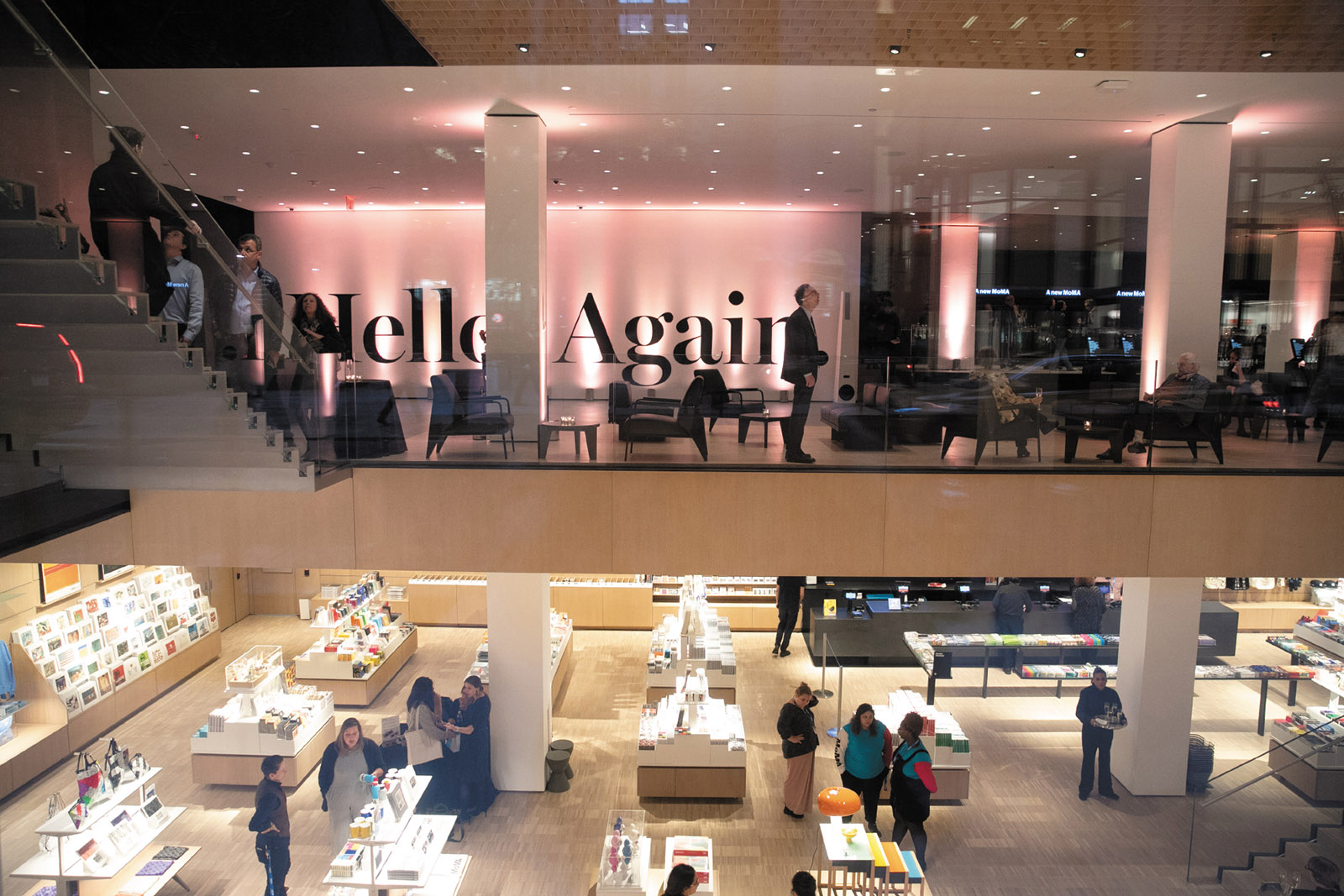
Before MoMA closed in 2002 for a two-year hiatus, during the Taniguchi expansion (when it carried on reduced programming at its temporary Queens outpost, MoMA QNS), it had about 1.5 million visitors annually, a figure that grew to 2.5 million with the reopening of its much-enlarged premises. Attendance grew to 3 million during the last decade, but in its latest incarnation MoMA officials estimate that it will reach 3.5 million admissions per year. The current addition of 47,000 square feet of gallery space might seem enough to absorb a million and a half more people, but no changes have been made to one of the worst aspects of Taniguchi’s design: the claustrophobic escalators that have happily not been replicated in the new west galleries that occupy the base of 53W53. Those upper stories are accessed by elevators and stairways, but there will likely be much more congestion on the east side of the complex, where the vertical circulation—a combination of escalators and elevators—remains essentially unaltered.
The DS+R galleries are generally well executed if not particularly memorable. More troublesome is the disorientation that sets in as one attempts to navigate a complete circuit through such a vast horizontal area composed of one very similar room after another. Several early visitors complained of how hard it is to find one’s way around the new floor plan, especially if one is looking for specific artworks, but perhaps it is now assumed that everyone will consult apps on their smart devices to determine where they are.
A few years after the Taniguchi building opened in 2004, I ran into the architect spouse of a MoMA curator who confessed that even he as a professional often did not know where he was within that bafflingly organized series of interiors, despite having to attend social events there regularly. That lost-in-space feeling persists in the Taniguchi portions of the museum, but is hardly absent in the new DS+R areas. After each of my two visits at press previews, I realized only belatedly how many galleries I had missed because the confusing route through the principal permanent collection floors makes it easy to overlook parts of each expansive layout.
3.
The very good news is that MoMA is finally displaying a far higher percentage of works by artists who for decades have been systematically marginalized if not fully excluded from mainstream museums—especially women, artists of color, and those from beyond the long-dominant European-American axis of exposure, promotion, and influence. The rejiggering of any anthology beloved by a large audience invites inevitable second-guessing of “Why this and not that?” Yet despite predictions that the reinstallation of MoMA’s incomparable permanent collection would dispense with both chronology and distinctions among various mediums, there was no need to worry.
The revised selection and installation still follow a roughly consecutive though not rigid timeline, and the intermingling of painting and sculpture with everything from photography and industrial design to film and graphics is almost uniformly successful (with the exception of occasionally distracting sound leakage from movie clips). This reassortment of material is hardly a new idea, though, even at MoMA, where Riva Castleman’s multimedia 1991 exhibition “Art of the Forties” combined diverse categories to such enlivening effect that one expected the practice to continue, though on West 53rd Street that was not fulfilled in any meaningful way until now.
The decision to juxtapose works by later artists that resonate with those of earlier periods is validated by several brilliant mash-ups. A gallery devoted largely to the magisterial Matisse, perhaps the most overwhelming room in the entire museum right now, is further elevated by Alma Woodsey Thomas’s glowing 1973 abstraction Fiery Sunset, an exceptional painting created by an African-American woman two decades after the French master’s death, and which has no trouble holding its own.
Also unfounded were fears that MoMA’s pathbreaking architecture and design department, the first of its kind in any museum, was headed for extinction because it would no longer be accorded its long-familiar series of interconnecting galleries. This turns out to be not such a terrible thing, and in the opening installation there are no fewer than seven rooms devoted to various thematic aspects of the building and design arts. The scattershot positioning of those displays throughout the sprawling complex will certainly tax the patience of design aficionados intent on seeing all of them, but a counterargument might be that this dispersion will encourage them to look at much else as well.
The biggest problem with the permanent collection’s new presentation is a marked dumbing-down of written information, both in gallery titles and wall texts, typified by a concerted effort to eliminate any reference to the “isms” and other accepted terms that have long been standard in art historical reference. Such classifications may sometimes have been too glibly encompassing, but they did provide a useful way to organize vast bodies of visual information. At the reconceived MoMA, however, the curators, who are otherwise to be heartily commended, have gone to sometimes comical extremes to devise new catchall nomenclature and have merely inserted vaguely generalized substitutes for older usages.
The only “isms” on full display here are revisionism and Surrealism, which was spared in this thoroughgoing purge perhaps because it is a favorite of theory-oriented academics who might denounce any toying with their hobbyhorse. Thus in place of Dadaism we now have “Readymade in Paris and New York,” as if laypersons know that specialist term for the innovation of appropriating a found object and declaring it a work of art—exemplified by Marcel Duchamp’s Bicycle Wheel (1913/1951) and the snow shovel he named In Advance of the Broken Arm (1915/1964), both seen here in facsimiles recreated by the artist after the originals were lost. We also have “Masters of Popular Painting,” a designation more befitting Norman Rockwell and N.C. Wyeth than the Outsider artists unknown during their lifetimes and happily displayed here (including the magical Bill Traylor).
Then we get “Action Painting” for Abstract Expressionism; “Planes of Color” for Color Field painting; “Unsteady Optics” for Op Art; “Idea Art” for Conceptualism; and, most ludicrous of all, “From Soup Cans to Flying Saucers” instead of the universally understood Pop Art. The curators’ imagination was clearly exhausted by the time they reached a grab-bag gallery of disparate 1960s and 1970s works categorized as “Breaking the Mold,” which could define almost anything in the entire inaugural presentation. One might as well rechristen the Gothic as “Pointy Piety” and the Rococo as “Curlicue Charm.”
If one harbors cavils or quibbles about MoMA’s reinstallation, one should keep in mind Mark Twain’s meteorological advice about New England: “If you don’t like the weather, wait three minutes.” Every six months, one third of the permanent collection’s contents will rotate, a means of exhibiting far more of the museum’s 200,000 works than ever before. But this smart idea did not need an all-consuming expansion program to be put into effect, and could have been done back in the days of the César Pelli galleries, just as a more inclusive roll call of long-neglected artists of all sorts could have occurred decades ago if the determination had been there.
It will take some time to determine how well the new megalo-MoMA will perform physically for visitors, especially as the media blitz that accompanied its unveiling will doubtless spur immense curiosity. Journalists—who can always attend press previews and other special events at museums to avoid subway rush-hour conditions in the galleries—have not yet addressed this issue with any urgency. Will there be a point at which its interiors become unbearable? The social secretary of a leading MoMA trustee noted that at the art world preview party held the Friday night before the public was first admitted, four thousand guests were so well absorbed by the far-flung spaces that the museum did not seem full at all. The feeling was rather different two days later, when MoMA announced a free-admission Sunday on social media and ten thousand visitors descended.
The notion that MoMA will become a more user-friendly art-viewing environment now that it is so much bigger is likely to be mistaken, despite the institution’s continuing belief that perpetual growth can ameliorate the basic problem that its officials have admitted is of their own making. “We are a victim of our own success,” the museum’s longest-serving director, Glenn Lowry, said in 2014, ten years after the previous expansion he oversaw was completed. (He took over the top position in 1995, and his current contract runs until 2025, when he will be seventy-three.) But Lowry’s disingenuous cliché makes it seem as if the fundamental changes that MoMA has undergone during his leadership were simply the result of doing too good a job. The mindset that bigger and more are preferable to less but better has incrementally eroded the average person’s ability to experience the world’s greatest collection of modern art under pleasant conditions that previous generations took for granted.
Far from this expansion helping to alleviate overcrowding, it could well make it much worse. In their evaluations of the new MoMA, several commentators have cited the phenomenon known among economists as induced demand, whereby an increase in availability spurs a reciprocal increase in consumption—for example, the construction of bigger highways and parking lots results in more automobile congestion rather than less. Where will all this end? Surely not at the 708,000 square feet MoMA now occupies. No matter how idealistically (or cynically) one may try to popularize a museum, it is not a sports stadium, and most art cannot be properly enjoyed by 40,000 people in one place at one time like a Mets game. All the same, a common thread in reviews of MoMA’s transformation is the certainty that it will only be a matter of time, and a brief one at that, before the museum starts plotting its next enlargement.
MoMA’s endorsement of unending growth is central to the advancement of corporate values that lie at the heart of the existential crisis facing not just it and countless other cultural institutions, but the planet itself. For more than two decades, MoMA has been in a perpetual state of aggrandizement to anticipate the imagined needs of the twenty-first century and future generations yet unborn. Well, here they come now, in their legions, looking for Instagrammable moments, selfie ops, a Warhol or Van Gogh or two, and maybe a glass of wine on the new fifth-floor café terrace overlooking West 53rd Street. What they will take home with them is anyone’s guess.
This Issue
December 5, 2019
Against Economics
‘I Just Look, and Paint’
This Issue
December 5, 2019
Against Economics
‘I Just Look, and Paint’
-
*
See my “MoMA: A Needless Act of Destruction,” The New York Review, May 23, 2013, and “MoMA Loses Face,” NYR Daily, January 14, 2014. ↩