I was always interested in typefaces, but I became obsessed with them only when my wife got pregnant. The psychological mechanism seems to have been something like this: For five centuries, printers’ type was made of lead; the form into which the molten metal was poured and which gave the letter its shape was called a matrix—the Latin word for womb. At a time when something that mattered a great deal to me was taking shape in a real womb, I could not stop thinking about letters and symbols that had taken shape in metaphoric ones.
For me, as for many other people who care about type, a typeface should be personal and expressive, like a human face. For others, type should be an impersonal machine for transmitting data. Each group favors different styles of type. When the documentary film Helvetica appeared a few years ago, I didn’t rush to see it, because, as someone says in the film, Helvetica is “the most neutral typeface,” the one with the least appeal to those whose feelings about type are tangled up with their feelings about people.
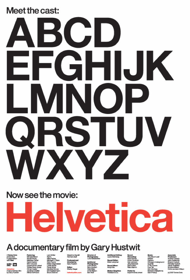
Now that I’ve seen the film, I’m glad I did, even though, at eighty minutes, it’s twice as long as it needs to be. Much of it presents graphic designers talking sensibly or fatuously about Helvetica, either for or against it, while the filmmakers remain too cool or dim to have views of their own. When the designers aren’t talking, the film shows pretty images of Helvetica on walls and posters and anomie-inducing music floats by on the soundtrack. But Helvetica proves unexpectedly to be a sharp comic essay about human folly. Its unspoken and apparently unintended theme is the folly of utopianism, the ancient fantasy that disorder can be tamed, that the disruptive elements of life can be suppressed, and that people can be shaped and trained into behaving as the authorities think they should. The film’s comic hero is an anti-utopian rebel who despises Helvetica for its corporate anonymity. A utopian graphic designer who seems to prefer Helvetica to human beings is its comic butt.
Anyone who used a computer in the late twentieth-century remembers Helvetica as one of the three typefaces available in almost any word-processing program and on almost any printer. The other two were Times Roman, based on the type designed by Victor Lardent for the Times of London in the 1930s, and Courier, based on the type designed by Howard Kettler for IBM typewriters in the 1950s. Helvetica was also designed in the 1950s, but some of the designers interviewed in the film seem almost surprised by the fact that it was made by human hands and not generated parthenogenetically by the simple lines and curves that shape its letter forms. Unlike the greatest type designs, which are always the work of individual artists, with their own unique genius, Helvetica was produced by two designers working together to create a neutral typeface, neither of whom (as the son of one of them says in the film) was capable of designing a typeface by himself. Still, Helvetica is so anonymous and impersonal that the thought of two human beings conceiving it over a drawing board seems faintly obscene.
As the documentary makes clear, Helvetica is the purest product of a twentieth-century utopian typographic ideology that favored modern-looking, unornamented type of the kind known as sans-serif faces, as opposed to the older designs known as serif faces. Serif typefaces—a group that includes Times, Caslon, Garamond, and others typically used in books, magazines, and newspapers, and on the screen you are reading now—have small additional strokes at the ends of the lines and curves that shape a letter or number, such as the small horizontal stroke at the foot of the letter “p” or the strokes at each end of “s.” (Historically, these additional strokes perhaps derive from traces left by a calligrapher’s pen or a stonecutter’s chisel.) Sans-serif typefaces, including Helvetica, Arial, and the typefaces used in timetables and telephone books, lack those extra strokes. No one knows the origin of the word “serif,” which seems to date back to the early nineteenth century, when sans-serif types came into common use in cheap newssheets and broadsides.
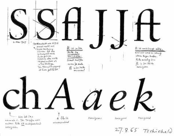
Starting in the 1920s, many European designers convinced themselves that sans-serif types were rational and modern, while serif types were bourgeois throwbacks like lace antimacassars. In 1928 the German designer Jan Tschichold championed sans-serif faces in his influential modernist manifesto, Die neue Typographie. The modern man’s vision of the world, he wrote, “is collective-total, no longer individual-specialist.” We need a “typeface expressive of our own age,” and that typeface “must be free from all personal characteristics; it will be the work of a group.” Of all the available typefaces, sans-serif, he wrote, “is the only one in spiritual accordance with our time.” In 1933 the Nazis arrested Tschichold for Communist sympathies, but he escaped and over the next few years renounced his modernist ideas: “To my astonishment I detected most shocking parallels between the teachings of Die neue Typographie and National Socialism and fascism.”
Advertisement
As head of design at Penguin Books during the firm’s great typographic flowering in the late 1940s Tschichold showed that traditional serif-face typography, using such classic faces as Baskerville, Bembo, Caslon, and Garamond, could be as lively and lucid as the most rational-seeming modernist designs—and far more readable. Serifs are not ornamental but functional: most of them are horizontal strokes that help to guide the eye rapidly and smoothly across the page. Sans-serif types, in contrast, present a thicket of vertical strokes that slow down the eye’s horizontal movement. Late in his career Tschichold designed a serif face named Sabon, which is sometimes cited as the most readable typeface ever made for the printed page.
Helvetica gives a lot of time to ideologues who care more about purity than about reality. Near the start of the documentary, someone says of Helvetica, “It seems to come from nowhere. . . . It’s this beautiful, timeless thing.” Its most passionate proponent is the Italian designer Massimo Vignelli, whose goal is to make typography as corporate and inhuman as possible. He preemptively dismisses the view expressed later in the film that a typeface derives from the individual rhythms of a person’s handwriting. “There are people that think type should be expressive,” he says. “They have a different point of view from mine.” He takes great pride in the logo he designed in Helvetica for American Airlines. One of the unintended morals of this film is that preening utopians are the natural vassals of corporate executives.
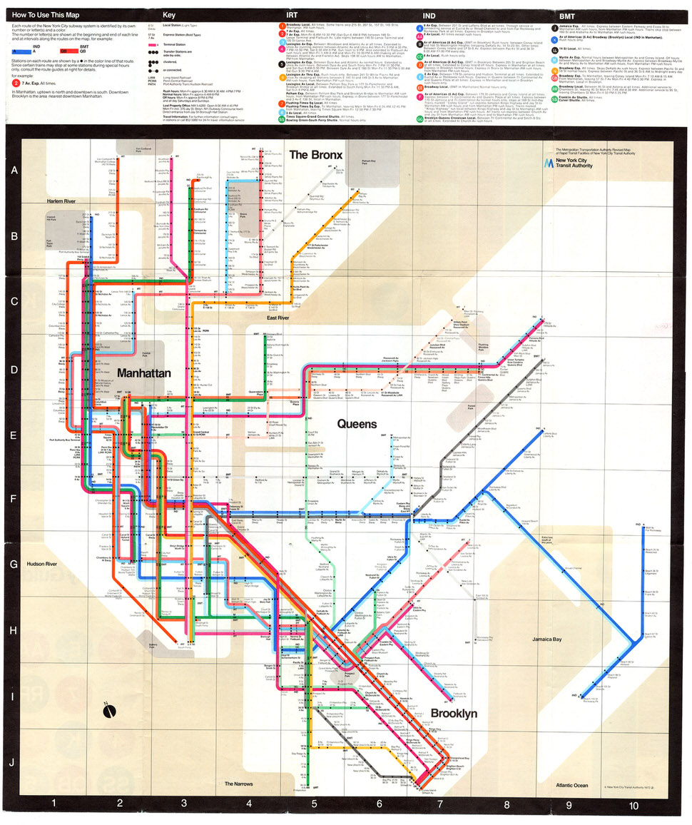
With his fussy utopian snobbery, the Vignelli portrayed in this film is a great comic invention. He is the embattled Don Quixote of typography: “The life of a designer is a life of fight—fight against the ugliness.” In 1972 Vignelli designed a notorious and short-lived New York subway map that represented all the routes in abstract geometrical form, making it almost impossible for a traveler to guess the actual location of any stop. Because Vignelli’s map is true to his design principles, it is both ugly and unusable, but Vignelli’s only regret is that it wasn’t as unusable as it should have been. In the outtakes included with the DVD version of the film, he says that the map would have been better had it omitted the geographic representations of the boroughs and included only the abstract order of the subway lines.
The anti-Vignelli in the film is Erik Spiekermann, the type designer who is the film’s comic hero. Spiekermann loves typefaces as if they were human: “They are my friends.” Helvetica, he says, has none of the rhythm and contrast derived from human handwriting that makes a type readable.
The guy who designed it tried to make all the letters look the same. Hello! You know, that’s called an army. That’s not people.
Spiekermann says of his own typefaces, “They are never perfect.”
What Robert Browning wrote in his poem “Andrea Del Sarto: Called ‘The Faultless Painter,’” is more or less true of Helvetica. Andrea’s portraits are all perfect and they all look the same. Michelangelo and Raphael were less perfect painters than Andrea, but far greater. The two great geniuses of twentieth-century typography, Matthew Carter and Hermann Zapf, who both appear in Helvetica or its DVD outtakes, never designed a perfect typeface.
Carter, who began his career cutting type into metal and later drew screen fonts for Microsoft Windows, is the Leonardo of modern type, both technologically expert and with an intense clarity of artistic vision. Zapf, whose type designs derive from his spectacularly fluid and expressive calligraphy, is its Michelangelo. Carter seems incapable of saying an ungenerous word, but when he praises Helvetica he also points toward its inhuman abstraction:
It’s very hard for a designer to look at these characters and say, how would I improve them, how would I make them any different? They just seem to be exactly right. I’m glad no one ever asked me to
second-guess Helvetica, because I wouldn’t know what to do.
But every great type design can be second-guessed, because it is the work of an idiosyncratic and imperfect human being. Carter’s own designs include ITC Galliard, a splendidly vigorous but notoriously imperfect typeface with an annoying italic “g” that looks like a pelican. Like all of Carter’s designs, including even his redesign of the typeface used in telephone directories, Galliard has the uneven rhythm and contrast of handwriting, and the same imperfect rhythms enliven his designs for the most readable of all computer typefaces, the serif face Georgia and the sans-serif Verdana.
Advertisement
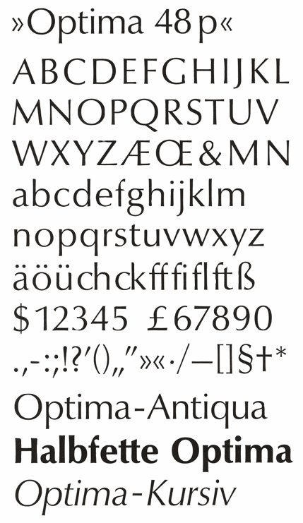
Hermann Zapf, in the DVD outtakes from the film, says of Helvetica, “It’s a good design, no question.” But his innocent-sounding observation that the design “has a touch of the nineteenth century” demolishes Vignelli’s fantasy that Helvetica is timeless. Zapf adds that he has never used Helvetica in his typographic work—a notable omission, because, during his seventy-year career, he seems to have used almost everything else. Zapf’s own designs include Palatino, a serif face in which he reworked Italian renaissance calligraphy for use with modern technology, and Optima, a face that is technically—but not in spirit—a sans-serif, and which seems to me one of the triumphs of twentieth-century art.
Optima is the anti-Helvetica. Zapf designed it in the early 1950s, around the same time that Helvetica was taking shape, but he had a completely different and far more profound sense of what a typeface ought to be. Instead of being mathematically perfect and untethered to a particular time or place, Optima embodies a subtle understanding of history. It is nominally a sans-serif, but its lines swell subtly toward their endpoints, with the result that they suggest classical serifs without actually having them. Zapf based the letterforms on carvings he found on Italian renaissance grave stones, and their overall shape and proportions unmistakably derive from the fifteenth and sixteenth centuries. But their sleek lines suggest the aerodynamic curves of modern technology, and the whole design could only have been invented in the mid-twentieth century.
People who love type have been known to confess to each other in secret—so they can avoid being quoted in Private Eye’s Pseuds’ Corner—that in certain moods they are emotionally moved by Optima. Its echoes of renaissance carvings evoke nostalgia for a lost and unrecoverable past. Its streamlined curves evoke the forward-looking hopes of the machine age. Like other great works of art it prompts intense mixed feelings, a double sense of loss and gain: it simultaneously portrays something that has receded into the abyss of time and something that is still emerging.
Helvetica is the ideal typeface for corporate logos and any other function in which individual persons have little value of their own. Optima, in contrast, is a typeface that can be put into service to indicate the unique value of individuals. When Maya Lin designed the Vietnam Veterans Memorial in Washington, she chose Optima as the face in which the names of the dead would be etched into the polished stone wall. Every name—each signifying a particular, irreparable loss—is recorded in letters that had been designed by one person’s singular hand.
