
The Willem de Kooning Foundation/Artists Rights Society (ARS), New York
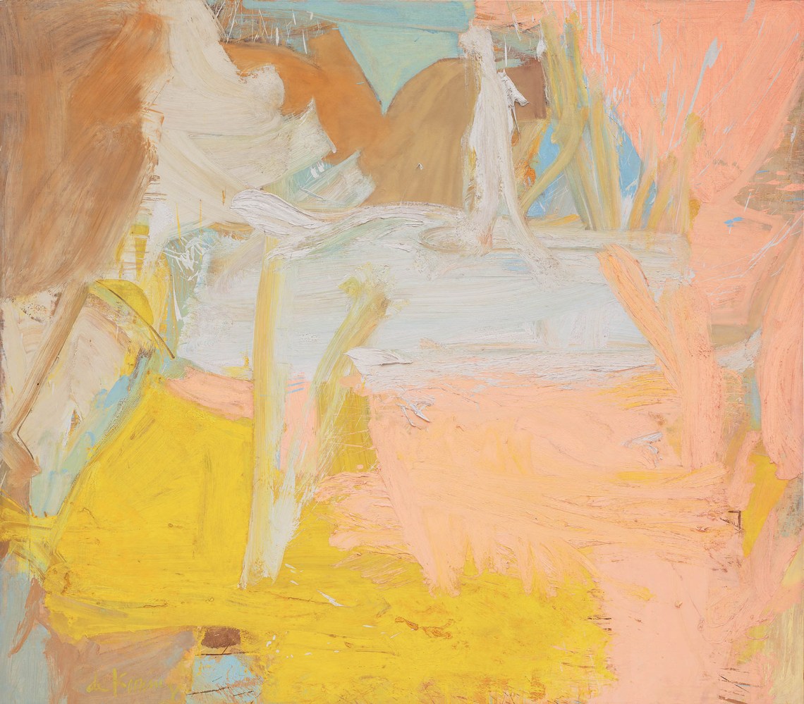
Willem de Kooning: Composition, 1955
When he was in the mood, Willem de Kooning had a gift for titles both memorable and unconfining. Gotham News, Suburb in Havana, and (my favorite) Rosy-Fingered Dawn at Louse Point provide catchy handles for images as elusive as they are beautiful. Alas, he wasn’t always in the mood; he stuck Composition (1955)—one of the most glorious of all Abstract Expressionist paintings—with one of his least imaginative titles. It is on loan from the Guggenheim for the smartly curated small retrospective at the Mnuchin Gallery’s graceful 1914 townhouse.
The first floor of the show focuses on the artist’s “Women” series of the early 1950s; the second floor offers city- and landscape-based abstractions from the mid-1950s to the early 1980s. The blandly titled Composition features prominently in one of the second-floor rooms, its high-ceilinged elegance providing the perfect foil for the painting’s raucous energy, which is diffused in the vast spiral of the Guggenheim. It’s gratifying to see this radiant, voracious tangle of paint get the setting it deserves.
In 1955, de Kooning was at one of several artistic peaks. By then, he had completely internalized his synthesis of Cubist structure, including Picasso’s Surrealist variations, with Pollock’s innovative materials and expansive scale. Soutine had shown de Kooning how to charge his refined line with a juicier, more muscular gesture. For twenty years, he’d experimented with the stuff of paint—using commercial house paints, additives like plaster, sand, and charcoal, and every gradation of viscosity from watery washes to lava-like accretions of pigment. This arsenal of effects was now at his spontaneous command and he unleashed it in a series of ambitious abstract paintings that evoke cityscapes or highway vistas. In Composition, the addition of sand or other grit to the paint creates a drag against the canvas, shifting the emphasis from the speed of the stroke to its driving force. It’s as if his hand accelerated hard in first gear in thick, rough passages and then shifted in a heartbeat to fourth, leaping ahead as the suddenly liquid paint splashed across the surface. If you’re not interested in this kind of wild ride, de Kooning isn’t for you.
Composition is like a Cubist painting smashed up with a crowbar. Wedges of hot red and aquamarine collide and clatter apart flinging off shards of yellow and splinters of black and white. This distinctive palette, which recurs in his paintings and drawings from the early 1940s until the late 1950s, is strongly reminiscent of the Roman frescoes in the Met that de Kooning admired as a young artist in the 1930s. Characteristically eliding past and present, even as he evokes Pompeii, he simultaneously channels the Gypsy Red and Cascade Green of a 1950s Chevy Corvette. This egalitarian embrace of both art history and pop culture wasn’t lost on John Chamberlain, Robert Rauschenberg, or Andy Warhol, all of whom owe a debt to de Kooning.
The Willem de Kooning Foundation/Artists Rights Society (ARS), New York
Willem de Kooning: Pastorale, 1963
The Willem de Kooning Foundation/Artists Rights Society (ARS), New York
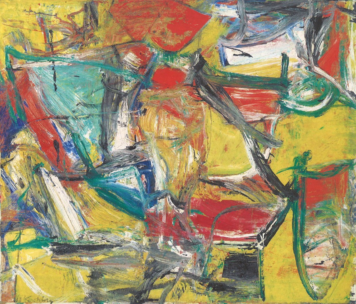
Willem de Kooning: Police Gazette, 1955
In one of several subtle curatorial pairings in the show, Composition is flanked by another, smaller contemporaneous painting, Police Gazette (1955), which employs virtually identical color and must have been painted in tandem as a study or a spin-off. The juxtaposition highlights de Kooning’s lifelong practice of deriving families of images from a single painting through an array of novel processes—for example, lifting parts of a wet painting off onto pieces of paper and printing them onto a new canvas, or making tracings of paintings in development and transferring them from one picture to another.
Nearby, in the gallery’s second-floor rotunda, hangs another painting the same size as Composition (80 x 70 inches), but turned horizontally. This one, Pastorale (1963), also has a chromatic sibling, unfortunately not present in the show: the aforementioned Rosy-Fingered Dawn at Louse Point (1963). Their shared chord of conch-shell pink, marigold, aqua, and ivory, evoking the skies of Tiepolo’s Italy as much as of the Hamptons, is so distinctive as to strongly suggest that the two paintings were part of a single gestation process. These pairings also emphasize de Kooning’s habit of “breeding” (his word) colors in large salad bowls, blending pigments until each has a distinct identity, then casting several together in an ensemble with a particular sense of place and light, creating what he referred to as the “likeness” of the abstract painting, as in a portrait, without which he felt abstraction lacked a connection to the world of lived experience.
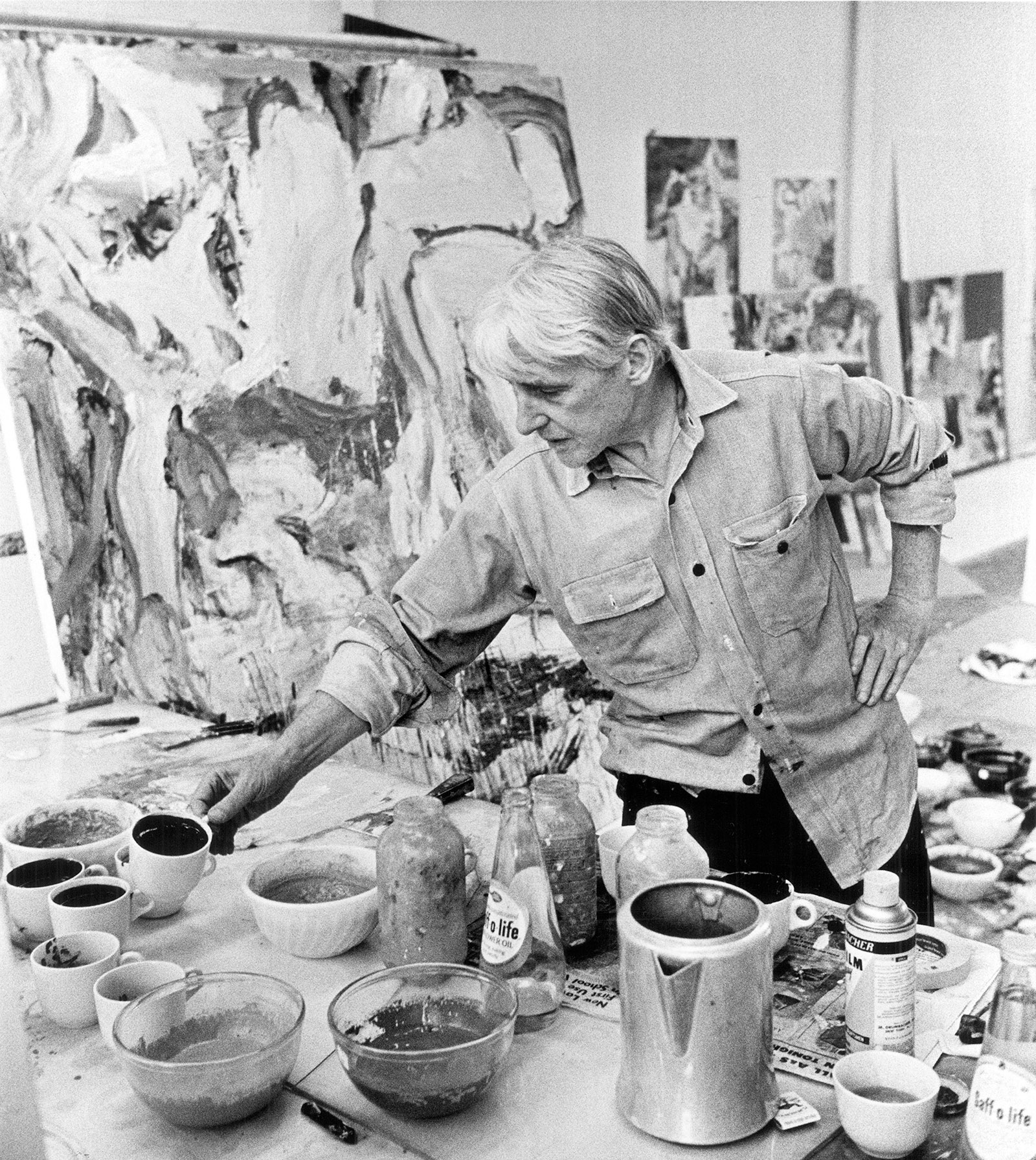
Robert R. McElroy/Getty Images
Willem de Kooning mixing paints in his Long Island studio, New York, November 1, 1987
Advertisement
Facing Composition across the second-floor gallery is Untitled XVI (1975), painted twenty years later, well after the artist’s move to the Springs, on eastern Long Island, from the East Village. The confrontation vividly demonstrates de Kooning’s “city to country” evolution from the 1950s to the 1960s. The Hamptons had long been a playground for the Abstract Expressionist circle, and as Pollock did several years earlier, de Kooning made the move there to escape the distractions of his increasing fame and its attendant temptation of alcohol abuse. Once settled, he began to respond intensely to his new surroundings—discovering, for example, echoes of his native Holland in the flat coastal landscape.
Over the course of five or six years, this new pastoral world profoundly affected the course of his work. Untitled XVI is a splendid example of this later, aqueous manner. In this period, he began to slake the paint with an innovative brew of safflower or poppy oil and water, which he applied with brushes he’d boiled to soften the bristles, onto smooth-sanded surfaces, sometimes paper glued to canvas, to achieve his desired maximum velocity of stroke. This hybrid medium created intricate, baroque textures as it dried, surfaces dimpled like orange peel or wrinkled like bath-puckered skin. The technical risk of this colloidal mixture is that the paint forms a skin on the surface while remaining soft underneath, in some cases even now, half a century later—though de Kooning is hardly the only modern artist to try the patience of conservators.
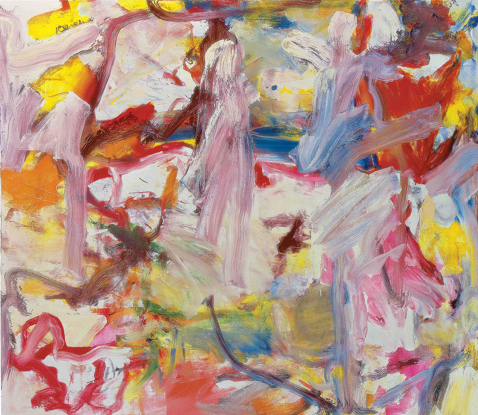
The Willem de Kooning Foundation/Artists Rights Society (ARS), New York
Willem de Kooning: Untitled XVI, 1975
A landscape at heart, Untitled XVI pivots around a single large vertical stroke, a kind of gestural protagonist, from which a welter of other horizontal and diagonal strokes emanate to form earth and sky. No sooner has the landscape image formed in your mind than it dissolves in a quaking sea of pigment, only to resurface and again disappear. The color is alternately brilliant and broken, like jewels flung in a ditch. The painting is to Soutine’s landscapes of the 1920s what Gerhard Richter’s Abstrakte Bilder series are to de Kooning’s. In both cases, the older artistic source is amped up, scaled up, and reimagined as something unexpectedly contemporary.
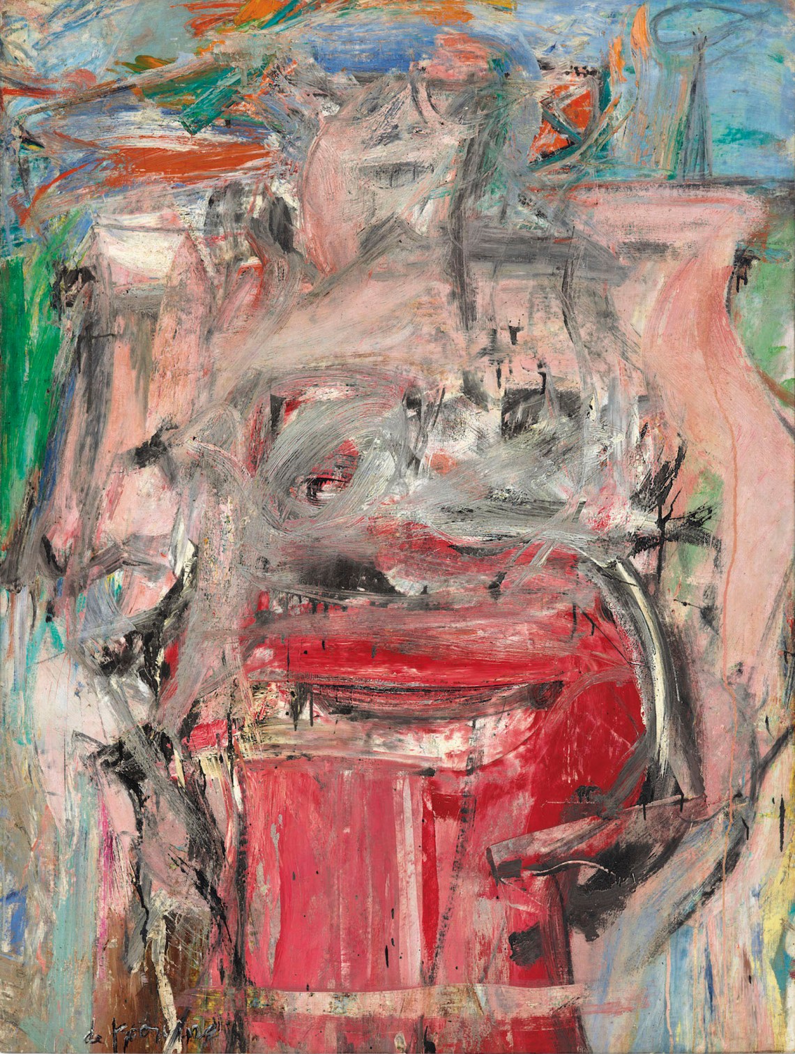
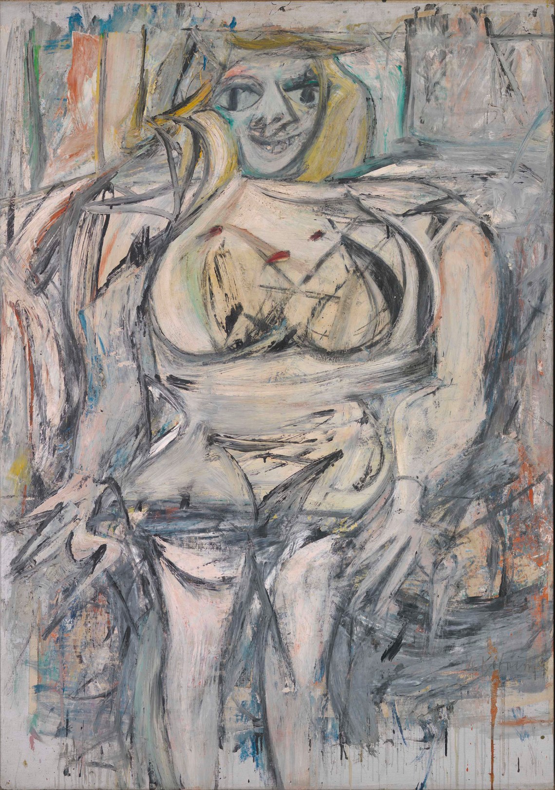
Back downstairs, the show offers no fewer than twelve drawings and paintings of women, seven of which relate to the 1950–1955 series that included Woman I (1950–1952), the artist’s best-known image. Sardonic and scary, woozy and lush, these paintings have been argued over bitterly since their first appearance. The literature on the subject is rich: most recently, extended reflections on de Kooning by art historians Rosalind Krauss and Richard Schiff offer fresh, nuanced readings. These vexed paintings were not his only attempt at the subject; it was one he returned to in cycles, each time discovering something new. The first, 1940s series is suave and gorgeously colored; the second, 1950s group, comic and awful, in the don’t-mess-with-Kali sense; the last series, the Sag Harbor women of the 1960s and 1970s, dissolves flesh into landscape, and landscape into flesh, like Rubens on acid. These are less icons, like Woman I (1952), than sensual hallucinations.
The Willem de Kooning Foundation/Artists Rights Society (ARS), New York
Willem de Kooning: Woman as Landscape, 1954–1955
The Willem de Kooning Foundation/Artists Rights Society (ARS), New York
Willem de Kooning: Woman III, 1952–1953
The seven drawings in the show are in pencil, charcoal, or various combinations of these with colored chalk, pastel, and paint. All but one are from the second series, so it’s fascinating to see these preparatory works on paper in the company of two large paintings from the series, Woman III (1952–1953) and Woman as Landscape (1954–1955), that hang in the room beyond. The two are complementary: in Woman III is a melancholy goddess hovering in a lowering, gray-green atmosphere, like ocean light before a storm. Woman as Landscape (1954–1955) is bright and brash, a vortex of cherry red and grass green. In this late entry to the 1950s group, de Kooning smears the outline of the figure into the enveloping landscape, creating a kind of double image, an early version of the fusion of person and place that was to become so important in his later paintings.
“Content… is a glimpse of something, an encounter… like a flash,” de Kooning told the critic David Sylvester in 1960. Who has described the spirit of his paintings better? Truth for him was fluid, protean. Just as he refused to be pinned down ideologically by the influential theoreticians of his day like Clement Greenberg, de Kooning’s paintings refuse to be defined as either “representational” or “abstract,” flitting restlessly between these notional polarities. Considered a virtuoso both by peers and successors, he wasn’t merely an acrobat with the brush; he was also, and more profoundly, an acrobat with the semantics of painting, playing the medium’s possibilities against one another to keep them open. It’s a thrilling and beautiful act to watch, a display of his intense desire to forge paintings from his own contradictions: his roots in the European Old Masters and his acquired taste for American pop culture; his careful craft and bold innovation; his architectonic intelligence and madcap improvisation; his grace and his violence; his ebullient confidence and corrosive self-doubt.
Advertisement
A small work on paper (mounted on canvas) in the show, Woman (1953), succinctly performs this splicing of opposites. The iconic figure, nearly centered on the page, is a monumental Venus of Willendorf, but her breasts are the teardrop eyes of an angry Mickey Mouse. No other painter of de Kooning’s generation makes it so hard to separate high art from low comedy. More than his painterly flourishes, it’s this embrace of contradiction that has made his work a source for generations of later artists, from his immediate successors, who included also Cy Twombly, Roy Lichtenstein, Jack Whitten, and Gerhard Richter, to contemporaries such as David Reed, Christopher Wool, Joyce Pensato, and Amy Sillman. All of these artists have mined de Kooning’s work for elements suited to their own purposes. That variety of interpretation is only possible because the vein itself is so rich.
“De Kooning: Five Decades” is at Mnuchin Gallery, New York City, through June 15.