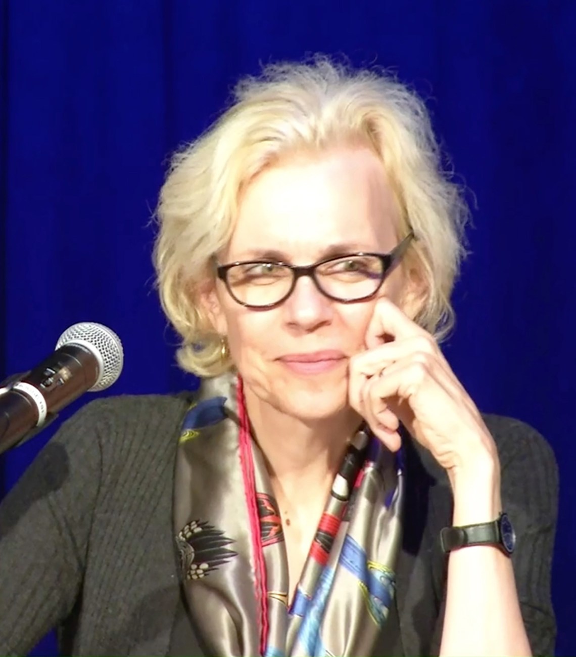
This article is part of a regular series of conversations with the Review’s contributors; read past ones here and sign up for our e-mail newsletter to get them delivered to your inbox each week.
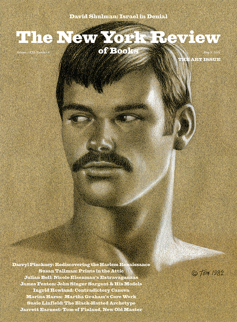
Susan Tallman has been writing about art and artists in The New York Review since 2019—on Vija Celmins, Gerhard Richter (“the poet of uncertainty”), the history of craft, Philip Guston, Hilma af Klint (“there are lots of snails”), Jasper Johns, and the “compositional aplomb” of Kerry James Marshall, among other subjects. In the May 11 issue she reviews a new exhibition and three books devoted to Giovanni Battista Piranesi, following a resurgence of interest in the master draftsman and printmaker, architect, and entrepreneur on the three-hundredth anniversary of his birth. And yet, as she says, he’s never really gone away, his prints popping up even in Logan Roy’s living room in the fourth season of Succession.
I interviewed Tallman by e-mail about Piranesi’s enduring relevance, the coercive wall texts at contemporary museums, and the fluctuating stature of prints.
Prudence Crowther: The very first issue of Art in Print, the international print journal you founded and edited between 2011–2019, included a discussion of new physical and digital fabrications of Piranesi’s designs. In your editor’s note you called him a “multi-tasking globalist in tune with 21st c. technological adventurism.” This time out you cite his 1769 “manifesto” on the cosmopolitan classicism of Rome as “a defense of multiculturalism avant la lettre,” whose pages “challenge the limits and prejudices of our own aesthetic rulebook.” Such as?
Susan Tallman: Well, we don’t like overstuffed ornamentation, and we get twitchy about the propriety of cultural appropriation and fusion.
Yeah, Artemis of Ephesus as a clock—not for Wirecutter. I like that Piranesi proselytized, but for a kind of anti-parochialism. Today, you’ve written, exhibitions and their wall texts too often try to “make the spectator see” in a particular way, and contemporary art, “despite its many claims of ‘intervening’ in systems of oppression, often mimics rather than disrupts the worst impulses of the world at large.”
“Make the spectator see the world our way, not his way” comes from a letter Mark Rothko and Adolph Gottlieb wrote to The New York Times in 1943, when a baffled critic invited them to explain their work and its aims. It’s a strident but useful summary of a particular view of art’s function in a particular moment: “We are for the large shape because it has the impact of the unequivocal.…We are for flat forms because they destroy illusion and reveal truth.” It was bombast in the service of humanism, but if you look at the work they were making, it doesn’t look bombastic at all—it’s lyrical and curious, as if they’re excitedly feeling their way forward in the dark.
My comment has largely to do with the way art is presented. At Art in Print we would get a hundred press releases a day, and most read very similarly: an undescribed body of work was guaranteed to challenge/critique/intervene in contemporary economies/discourses/systems that dictate/oppress/surveil individual difference/identity/memory. (ChatGPT, unsurprisingly, is quite good at generating this kind of prose.) It’s easy to poke fun at “woke” excesses, but the larger problem is that any kind of discovery has been preempted. It’s comforting but deeply boring (and ultimately dangerous) if all you are asking from art is an affirmation of something you already believe. The universe is a probabilistic place, at least from the vantage point of an individual living in it, and coming to terms with unanticipated outcomes is important.
You’ve quoted Gerhard Richter as saying that a good picture “takes away our certainty,” and suggested (Philip Guston) that doing so enables us to “begin to see the push and pull of impulse, recanting, and reconfiguration that constitute painting and, by extension, life itself.” But you’ve also cited a commonly shared human desire “to pin down a meaning greater than the self.” Does this frailty mean we’re always going to second-guess our eyes?
This is why I go back to the question of how art is presented. Press releases used to give more space to telling you what the art looked like, and museum wall texts used to be shorter and less prone to editorializing. Maybe they’ve all done intensive marketing research and found that people want to read more than they want to look, but I’m still pretty enamored of the idea that art is a place for raising questions rather than making statements. At an obvious level, your eyes get to roam all over a visual field any way they like, without the sequenced causality of language. And it seems a shame to kneecap that freedom by telling you what you should be experiencing. One of the things that concerns me at the moment (both inside and outside the art world) is our impatience with ambivalence and ambiguity.
Advertisement
The Getty kouros became way more interesting to visitors when people understood that nobody knows if it’s real or fake. Seminars are more engaging than lectures. Museum curators have a tough job, and I don’t want to shame anybody, but at a major exhibition last year I was behind two women who were walking slowly, looking carefully and chatting. Suddenly one of them uttered an “ugh!” of disgust—she was looking at the label: “I hate it when they tell me how to feel!”
The Vermeers in the amazing show now at the Rijksmuseum have obsessed people for a long time, and there are still lots of different views about what they’re supposed to mean. So either he was bad at his job, or his goal was not to have us read the picture for a single takeaway idea.
Of course it can be helpful to give people a toehold—to let them know, for instance, why a young woman is carrying two eyeballs on a plate—but Dan Brown did a huge disservice in convincing the general public that art was a code where x = y and once you’ve solved for x, you’re done. Meanwhile, critical theory encouraged a habit of considering works of art as demonstrations of particular textual propositions. Having taught in an art school, I’m aware of how much pressure young artists feel to have a coherent, smart-sounding “artist’s statement” to justify their work. Students who were lucky or more curious or more driven would eventually find that they had made something weird and wonderful for which they had no explanation. The others would keep making visually dull illustrations of their smart-sounding statements.
Your review of a recent Kerry James Marshall show touched on how an artist can encourage people to entrust their attention to the work alone.
In Kerry’s “Exquisite Corpse” show at the Jack Shainman Gallery he provided no wall labels, no press-release paragraphs, no list of inspirations and references; he wanted people to look slowly, to puzzle out what they thought was going on. The absence of words meant that you had to take time and let the ideas, connections, and humor arise from the visual experience. It’s figurative art by an artist who has been looking closely at everything from Hallmark cards to Goya Black Paintings since he was in grade school, so there are references to art history and popular culture scattered everywhere. But you can also approach it purely visually—he gives you enough without a crib sheet. It is captivating. Nothing is haphazard, and everything resists tidy resolution.
I’ve heard you say that “prints are the most overlooked domain of contemporary art,” and in your book The Contemporary Print from Pre-Pop to Postmodern (1996), you write that “contemporary print is simultaneously one of the most successful and one of the most disparaged art forms of our time.” If you were to cover the subsequent twenty-seven years, what would have changed?
In the Sixties and Seventies, prints were celebrated as the big new thing—there were formidable museum shows, splashy media coverage, new galleries and dealers and workshops popping up all over. An ARTnews article from 1972 included a painter’s observation that once, “when you saw a friend on the Long Island Railroad on an early Wednesday morning, you knew he was going to town to see his shrink. Nowadays you know he’s on his way to work with his lithographer.” The upper middle class were decorating suburban living rooms with Jasper Johns and Helen Frankenthaler and Sol LeWitt. And there were utopian predictions about how the future of art was Woolworth’s, not galleries, and that the high-end art market was a thing of the past. So…that obviously didn’t happen.
If you look at Thomas Piketty’s chart of income inequality in America from 1910 to 2010, you can see that the “print boom” comes at the time when incomes were at their most equal. The important American print workshops start up in the late Fifties, and the party’s over when Reaganomics kicks in. From then on the attention of the market—and of art magazines, critics, and commentators—is all on more high-end forms of art, or at the opposite end, on things like zines. Prints were in the unsexy middle ground. This didn’t mean that beautiful things weren’t being made, but prints went back to being thought of as what you bought if you couldn’t afford a painting. Once upon a time, print workshops and publishers could use the steady flow of modestly priced prints to offset the expense of making a large and ambitious project. Now that’s reversed: the sales of complex, wall-sized works make it possible to do modest black-and-white etchings. One result is that at the various fairs in New York during Print Week, you can still find something dazzling for under $500.
Advertisement
You once described your career as looking like the neutrino traces in the bubble chamber at Fermilabs, “a seemingly random array of alluring squiggles that may or may not have something to do with each other.” To pick one: you studied art history at Wesleyan. Then what?
The Jasper Johns print retrospective organized there by the great print scholar Richard Field was important for me because it was the first time I saw contemporary art that completely bowled me over. A couple of years later I went to work for Marian Goodman when she was starting to show European artists (Anselm Kiefer, Richter, et al.), and I began writing about art for East Village galleries. I went to graduate school at Columbia, intending to do contemporary, but a class with the art historian Barbara Novak redirected me to nineteenth-century American art and allowed me to see American culture more broadly as something specific and quirky, rather than the hegemonic default it so often seemed. I did my master’s thesis on the how-to books through which isolated American artists tried to learn the European canon—some were remarkably beautiful while being pedagogically hopeless, but all the ensuing misunderstandings led to some amazing painting. (In the downtown part of my life, meanwhile, I was a founding guitarist in Band of Susans.)
Then, because prints were still considered kinda sorta relevant, Arts Magazine asked me to do a monthly column on them, which led to the book on contemporary prints. I moved with my family to Europe (Amsterdam and Berlin) for most of the Nineties, and then my husband took a job in the sound department at the School of the Art Institute of Chicago. I taught art history, including a class I designed in authorship, authenticity, and forgery, which is a great subject because it forces you to reckon with how inadequate our aesthetic, moral, and legal distinctions are for dealing with real objects.
That maiden issue of Art in Print quoted Leo Steinberg: “Without prints, you don’t understand the culture of the world.” He said that twenty years ago. Would you formulate it any differently now?
That was our motto. He was talking about how visual ideas traveled through prints—specifically about a Mughal painting of a Descent from the Cross.
My mother-in-law had a wonderful Annunciation painting over the fireplace—Andean, maybe eighteenth-century. Some years ago I stumbled upon two sixteenth-century engravings by Hieronymus Wierix that form the painting’s source code: the Virgin and Gabriel were cribbed from one, the Terry Gilliam–like god and angel from the other. What’s great is that one of the Wierixes was also adapted by a Ming Dynasty woodcut artist in China. In each of these you can see an artist grabbing something on offer—a new idea about the magic of pictures—and inventing something new.
Recently there’s been a lot of scholarship around this kind of image travel in the Early Modern world, and naturally it flows in both directions: chinoiserie in Europe, Annunciations in China. This can easily get entangled with the exploitation and power imbalances of imperialism, but the truth is that everyone appropriates: it’s how culture moves, it’s how we learn. In an ideal world you find a way to do this without massacring people and stealing all their stuff. At their best, prints are an instrument of that ideal world.