A painter is like the pilot of a small boat—constantly correcting course, ever alert to changes in the weather, trying not to get swamped by the wakes of larger boats, steering toward the distant shore. A lifetime of painting requires more than just will; agility of mind helps. “Alex Katz: Gathering,” the artist’s long-awaited retrospective at the Guggenheim Museum, was both Olympian in scale and outlook and a hard-charging athletic event, sweeping in scope yet light on its feet. It started at a trot with a group of sketchbook drawings from the late 1940s and sprinted to a conclusion in the museum’s topmost galleries with several large canvases painted just weeks earlier.
Katz is among the least fickle of artists, and the overall impression at the Guggenheim was one of single-minded, stubborn idealism. This idealism is connected to a belief in social etiquette, of giving your best self. Katz, whom I’ve known for more than forty years, once told me that it’s bad manners to make a lousy painting—it’s rude to bore your friends. As you made your way up the Guggenheim’s spiral ramp, it was one goddamned masterpiece after another, triumphs of point of view, of touch and color and composition. Of image. Of style.
The show was also steeped in the glamour, partly nostalgic, of the bohemian life. The people who appear in Katz’s paintings attest to his lifelong commitment to poetry and modern dance, and to a sophistication that has nothing to do with fashion or money. Gathered at a picnic table in Maine or deep in conversation in downtown lofts, these are aristocrats of sensibility, blithely and self-confidently unconcerned with mainstream taste. Some young artists I know regarded the show almost ruefully as a memorial for a lost world, for a time before social media made obscurity a crime.
Every major artist’s path is singular, with different intersections of internal and external events, influences, and talents, though certain largely unrepeatable conditions concentrate in each generation. After service in the navy at the end of World War II, Katz enrolled in Cooper Union, the leading art school at the time, when the pressing issue was how to escape Picasso’s pervasive influence. One answer was to decouple drawing from painting, on the theory that Picasso’s art was essentially linear and that American painting had to be more spontaneous, more “in-the-paint,” and less about drawn forms.
In response, the already contrarian Katz became an obsessive drawer, an on-the-fly recorder of urban life. His preferred observation post was the subway, with its rich cast of characters on display for the price of a token. The exhibition began with a group of these subway drawings from 1946–1949, and in them you can see Katz figuring out how much is needed to convey a sense of the image, what is necessary or extraneous. His talent early on was for grouped and contiguous forms, and you can anticipate how the massed shapes delineated by his exploratory line would soon be translated into painting. They’re only quick sketches, but he was already absorbing a first principle: that specificity—of perception and also of the marks themselves—is everything; the generic is the enemy of art. To draw is to search for the essence of a scene, and a detail used well is a visual synecdoche, a part that can stand for the whole. This cool approach to drawing, analytic, confident, and swift, underscores seventy years of painting.
So-called realist painting is the act of translating visual sensation into paintable forms, of deconstructing the three-dimensional world and reconstituting it as a thin layer of paint. Like a literary translator, the artist must choose from a range of effects, of painterly equivalences, to best render a scene. How do you depict sunlight on grass? How do you create an impression of water gushing over boulders, or the bending and folding of the planes of the nose as it connects to the face? What is the point of view, how much should be included or left out, what is the light source, the color palette, the overall lightness or darkness of the scene? These and dozens of other questions must be answered before the painting is even begun. The best painters first make you privy to and then allow you to forget the complex web of decisions that determined the image you’re looking at. The constructedness of it is both there and not there; this is realism’s specific vibration.
The earliest paintings in the exhibition, made soon after Katz graduated from Cooper Union in 1949, are modest-sized pictures of simplified figures and landscapes that convey a quivering alertness; looking at them is like watching a bird dog pick up a scent on a spring day. One sparkling painting, Apple Trees (1954), in which pale greens and yellows, light orange, and umber make up thin tree trunks and a tightly edited handful of leaves shimmering in the clear light of early summer, shows Katz alive to the instant when the brush makes contact with the canvas. This in-the-moment approach eventually propelled him down a path of technical distillation and refinement, which in turn powered a bigger, bolder, compositionally more complex realist painting than had been done before. But in the late 1940s and early 1950s he was just one of many artists struggling to integrate the lessons of Picasso and Matisse into an anecdotal realism. His paintings of that time, lovely as they appear today, were not yet expressive of an entire personality.
Advertisement
Then a strange thing happened: Katz hit the pause button. After making his professional debut, it became clear that these modest-sized, petite-sensation paintings were not going to take him where he wanted to go. He devoted the next three years to making small-scale collages with hand-colored papers. These essays in graphic legibility, none larger than thirteen by sixteen inches, employ cut and torn bits of color to create the kinds of scenes—boats in the harbor, a house on the horizon, a group of people on the beach—that later figured in the paintings. They’re a lexicon of Katzian images avant la lettre, studies of near and far, of concentrated visual data arrayed on colored fields that draw your eye toward the horizon.
More than anything, the collages are exercises in harnessing what is arguably the least understood of art’s tools: the power of intervals. The space between two people on the beach, how close a distant sailboat is to the picture’s edge, the visual counterpoint of a dot of orange that is someone’s shirt and the expanse of green grass behind it, the tension between two clouds in a blue sky or between two colors—everything is intervals. Our brains are pattern-recognition machines. Our eyes connect like with like; we make little visual jumps across physical space, comparing and contrasting scale, placement, distance. We register the gaps between light and dark forms and, most consequentially, between colors. As with music, these specific intervals have an emotional value. Katz told me recently that the collages were the first time he knew he was making art.
When, after three years of this research, Katz returned to paint on canvas, the result was more orchestrated compositions, with elegant and restrained tonal variations and intervals of color and pattern that immediately lifted his art to another level of sophistication. October 2 (1962) is a suite of six or seven closely related tones of warm gray that cohere into a melancholy bedroom on a gray day, the gray room punctuated by the grid of thin, charcoal-gray lines—a tall window frame through which we see still more gray. It’s a ravishing picture, elegant and lean and psychologically charged.
Also in the early 1960s Katz again turned to drawing to consolidate his aesthetic gains, this time with an emphasis on decoding the structure of three-dimensional forms—the way that any form, no matter how complex, can be broken down into interlocking planes. There is a striking leap from Double Portrait of Robert Rauschenberg (1959)—in which his fellow artist’s face and body are essentially outlined and filled in, with only a scumbly concession to what’s going on inside the contours—to the depictions of friends and colleagues like Kynaston (1963), Upside Down Ada (1965), or Yvonne (1965). These paintings and many others made during the 1960s, with their architectonic planes of facial anatomy, show a level of analytic intelligence that was not predicted by the earlier paintings. In realist painting, analysis of structure yields decisive shapes, which, when combined with tonal specificity, create a sense of form, of a real time and place. Katz’s increasing control of tonal values (how light or dark a color appears), of proportion and placement, was now undergirded by a more rigorous structural architecture.
On one level this is all just the grammar of realism. The bedrock of Katz’s famous technique is a degree of control over his materials that, sixty years on, few painters of any era can equal. It’s almost a contradiction, but one that must be sustained to make a representational painting, or any painting for that matter: you must be precise and loose at the same time. Ideally, what a painter is technically capable of is productively linked to a germinating idea, to what he or she sees in the mind’s eye; the moving brush is the response. Katz’s identification with what the brush can do at any given moment feels complete. The refined, at times almost delicate, yet always decisive manner of applying paint, nascently present from the beginning, now met the challenge of analyzing and reconstituting the image.
Advertisement
The technology of oil paint, if one can call it that, has remained relatively unchanged over the past five hundred years. How one handles these familiar materials—how one gets the paint from the can onto the canvas, to paraphrase Frank Stella—determines a lot, and the surface energy is indicative of what lies underneath, which is the artist’s intention. When Katz was a young artist selling few paintings for modest sums, he occasionally worked as a house painter to earn money. Far from lamenting this imposition on his time, he considered it excellent training, like roadwork for a boxer. It fosters a pragmatic approach to materials, to the paint itself, and it teaches you to handle a big brush, to cover large areas efficiently, to brush the paint out evenly and cleanly, and to make an edge that expresses the shape with a minimum of fuss.
Oil paint can be your friend or, as anyone who has tried to make a painting knows, it can also be your adversary. It seems to have befriended Katz early on. How the brush makes contact with the canvas sets the tone for the internal narrative of painting, the organizing of visual sensations into a coherent whole; it is the key to the artist’s identity. To use a literary analogy, the right brushstroke in the right place is the mot juste of the visible world.
One hallmark of Katz’s style is the way he spreads the paint out to the edges of a shape, neither making a big deal out of it nor neglecting the often complex, crenellated edges that allow shapes to lock together to create forms and that together vivify the sensation of looking. It is assertive but never heavy-handed or overbearing. Why is that simple efficiency of technique so satisfying? I suppose any display of virtuosity is satisfying, especially when it expresses a purpose. Something painted in a way that feels appropriate to the subject and to our time and place is reassuring and also energizing. The quality we call “rightness” points a way forward that feels real. I’m reminded of what Fairfield Porter wrote about the young Roy Lichtenstein: he “does not . . . torture the paint.” The “how” is just as important as the “what,” if not more so. It turns out that the how actually is the what—or at least cannot be separated from it. They share one nervous system, and that oneness is what allows style to matter.
By the mid-1960s Katz was armed with a superior technique that allowed him to scale up his images to the heroic size of New York School painting. With the increased surface area came a more considered social world: groups of figures at home or in a landscape. He applied his sharp, unsentimental intelligence to exploding and reconfiguring his compositions; the radically cropped images, the overlapping forms that exaggerate a sense of near and far, give his pictures a pulsating energy that heightens their immediacy. Katz’s style is an amalgamation of several different, even opposing aesthetic trajectories. Both Matisse and the all-over paintings of Jackson Pollock had to be reckoned with early on, and few people in the 1950s had even thought of them as part of the same conversation. Katz then took the conventions of realism and merged them with the flatness and scale associated with Pop Art. Unlike his Pop contemporaries, he eschewed the black outline of cartooning. His subject is not the mediated imagery of advertising but things seen in the here and now.
So great is Katz’s output over the past sixty-five years, and so consistently high the quality, that one could probably make a dozen different retrospectives without repeating more than a handful of pictures. The senior curator Katherine Brinson did an admirable job of selecting and installing the works at the Guggenheim, often pairing one or more small oil sketches or studies with the larger version as a way of illuminating Katz’s process—small to large—as well as his pictorial concision and decisiveness. The themes of the show were the indelible imprint of time and place on a receptive imagination, the immense appeal of a vanishing bohemian world, technique as performance, the pulse-quickening free jazz of color, and the life-enhancing quest for the concreteness of form. Taken together, these qualities and themes point to the act of painting as a long-form essay on how to live.
Brinson chose to emphasize the lyrical, gestural, and immediate qualities of Katz’s more recent work, somewhat at the expense of the more complex constructions from the 1970s and early 1980s. In those years Katz made paintings of enormous scale that feature social groups with a profusion of details, like clothing, furniture, and hairstyles—the semiotics of life as it was lived in lower Manhattan and on the beaches of Maine. These elaborate compositions, which Katz sometimes calls his “big heads,” are miracles of pictorial staging and execution; they’re today’s equivalent to the compositional complexity of the enormous history paintings of nineteenth-century masters like Géricault and Delacroix, only without the allegory. But unlike his nineteenth-century forebears, who built up their compositions over time with multiple sittings by various human and animal models, Katz painted his big group scenes, like all his work, usually in a day, a day and a half at the most.
Katz is able to work so rapidly and decisively because the large paintings are the end point of a lengthy process: an image begins as a series of oil sketches done from life, during the making of which he adjusts the color, cropping, and point of view. Once the essentials are decided, the image is repeated at a larger size, sometimes in a few different iterations. Scaling it up reveals certain opportunities: the interactions of the colors and values are made more precise, the drawing is refined, and any complexities, like the internal shapes of a rose, or a profusion of backlit hair, or the draping of a plaid dress, are subjected to the logic of painterly translation. Then the image is drawn in charcoal on large sheets of brown paper, providing a crisp outline of the forms. Next the drawn lines are perforated with tiny holes using a pounce wheel, through which charcoal dust is pounded, leaving a dotted line drawing on the primed canvas. The faint charcoal lines are then enhanced with very thin oil paint in raw sienna or red ocher, which, when dry, provides a precise map that can be followed in the heat of painting without having to worry about whether or not the forms are making structural sense. When it comes time to apply color, Katz is like a cool, thoroughly rehearsed jazzman on the bandstand, ready for his solo; he can just wail away without having to think too much about anything except the pressure of his hand on the brush.
Perhaps the inclusion in the exhibition of so many “fast” paintings—ones that feature a semiabstract image rendered in a limited palette with bravura gestures over a huge canvas—was a way of connecting to a new, younger audience for Katz’s work. It seems to have worked, judging from the throngs lined up to get into the museum. It also reflected the irrepressible stream of paintings that have emerged from Katz’s West Broadway studio in the past twenty or so years. At an age (ninety-six) when most painters—most people—are either dramatically slowing down or just plain down, Katz has been ramping up. It is not unusual to see several ten-by-twenty-foot canvases in his studio, paintings depicting the effect of looking up through the canopy of a tree to small patches of blue, or a row of lighted windows in an otherwise dark apartment building silhouetted against the night sky, or gracefully arching tree branches emerging from a dense gray fog, each one painted in a sustained burst.
Whatever the subject, these pictures are about the arm—the entire body—working the brush in controlled extravagance, every painterly reflex moving in tandem with visual memory to produce the image. The recent paintings are evidence of Katz’s continued interest in fashion and contemporary manners, personalities of the downtown scene, his family as a marker of time’s passage, the visual language of advertising and cinema, and the power of light to define shape. (If the paintings had a motto, it would be: “Follow the light.”)
To be sure, a fair number of intricate compositions from the late 1960s and 1970s were included. In David and John (1977), the poet John Ashbery is seated on a striped sofa beneath a window shaded with venetian blinds; his longtime partner David Kermani is perched next to him on an ornately carved chair. It’s an amalgam of a Vuillard interior with a still from a Fassbinder film. Rudy and Yvonne (1977) also depicts a well-known couple, the Swiss-born photographer and filmmaker Rudy Burckhardt and his wife, the painter Yvonne Jacquette. They are seen at their country house, yet in an odd configuration—at opposite sides of the painting, looking at each other in such a way that it’s hard to tell if we’re witnessing a scene of domestic accord or its opposite. The couple is separated by an open front door, its paneling rendered in crisp whites and grays. Beyond the open door a stand of trees is visible; it appears to be midsummer. Yvonne is backlit, the crown of her hair glowing a bright copper color and her shadowed face and loose blouse rendered in a few close-valued tones of coppery Mars orange and white. Rudy is seen in profile, the sun illuminating the edges of his nose, beard, and shirt. On one level it’s a scene of life as lived—there’s even a handwritten shopping list visible on the wall—but it seems as if something important is going on that we can only guess at. The painting is a reminder that we never really know what goes on between couples.
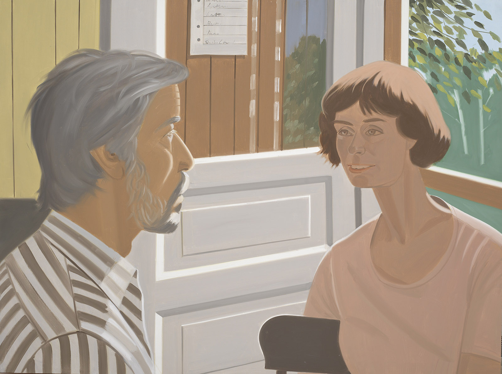
Alex Katz: Rudy and Yvonne, 1977
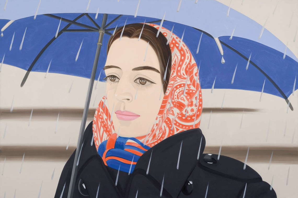
A masterpiece from that period, Blue Umbrella 2 (1972) (see illustration at beginning of article), greeted visitors as they entered the ground floor rotunda. It depicts Katz’s wife Ada in close-up, her head wrapped in an orange-and-white paisley scarf, a blue umbrella just above her head, and a rhythmic pattern of enormous, elongated raindrops slanting across the horizontal expanse. At eight by twelve feet, it has the grandeur of the big screen. Ada, the embodiment of easy glamour and boho chic for over sixty years, appears in full-on French-movie-star mode, with her pale complexion and frosted pink lips, her eyes focused on something or someone in the middle distance, her expression enigmatic. These paintings from the 1970s and 1980s are marvels of organization: the value pattern locks the dynamic compositions into place while the tightly controlled color harmonies complicate the narrative subtexts. It is anecdotal painting raised to the level of dramaturgy.
A word that comes up more than any other in conversation with Katz is “style” or “styling,” which means something like intention—all the decisions that go into making a painting—plus surface appearance and technique. It is both the way something looks and what that look means in the setting of art world taste. “Style” is one word for how people express themselves generally, and it’s what people notice about a painting even when they think they are noticing something else, like the supposed content. Katz seems to have always been interested in matters of presentation, the presentation of self—how the way you look, dress, dance, and the kind of music you dance to are an indication of what’s inside. His mother had been a star of the Yiddish stage before her marriage, and in the family there must have been a certain theatricality of self-presentation. It’s always interesting to chart how these early conditionings might show up decades later in one’s art. In the Katzian universe, who you are and what you want people to see and know about you are closer together than usual. You could even say the relationship between the two became one of his subjects.
Humankind does not live by culture alone. Even the most urban among us have to get out of the city sometimes. Katz’s other great subject is nature: landscape, trees, flowers, flowing water, and always the effects of light on perception. He has been spending summers in Maine for over sixty years, and the state’s indigenous white pine tree, with its elegant, laterally branching limbs from which descend needles like fringed fingers—a shop brush turned upside down—is a potent motif of the everyday sublime. Painting trees allows Katz to emphasize the extreme physicality of his manner of painting. He is able to knock out an eighteen-foot-long painting of blackish trees against a dusky blue sky in a matter of hours because he uses a big brush and paints with his entire arm.
The expanded, exploded landscape has given Katz an outlet for some of his most energized painting, and several of these late extravaganzas were in the show. One in particular, Grass 6 (2017), foregrounds how, with the accumulated years of experience, he can now just wade right in, confident that the ostensible subject can take care of itself. It is nearly sixteen feet long and contains only three colors. Enormous diagonal zigzagging brushstrokes intersect with long horizontal bands and shorter dots and dashes, all in a vivid yellow green on top of a brightly saturated yellow ground and painted with the rehearsed spontaneity of a dancer executing a big jump. It’s Katz channeling the spirit of Franz Kline; the slashing, angled strokes create clotted overlays and intersections, and the whole has an immediacy that is almost unhinged. Like any good work of art, it has so unfaltering a belief in its own rightness that any hesitation on the part of the viewer is swept away by the expansive, pulsating color.
Can color be contrarian? Color in painting can be broken down into three main components: hue, value, and chroma (how saturated it is). There is also texture: the thinness or opacity of the paint as it covers the reflective white ground also affects how we perceive a color. These are elementary concerns, and every painter engages with them, even if unknowingly. Being a good colorist means creating color harmonies that are surprising and emotionally resonant and that help generate meaning. Unlike what many people seem to think, choosing a pleasing shade of blue has little to do with it. Color is inherently relational; what creates excitement and stimulates emotional engagement is the juxtaposition of colors and the intervals between them.
There are two kinds of intervals here: those on the color spectrum and those created by the colors’ placement on the canvas. Color in painting creates meaning through these precise intervals, the little jumps the eye makes as it moves from one color to another across the painting’s surface. These optical landing pads work like notes in a musical chord; the intervals have a mathematical coherence in the brain, and the resultant sound clusters or bundles of colors work directly on our emotions.
An example of what I mean is Katz’s Sharon and Vivien (2009). This twelve-foot-long painting looks simple but is not. It features the giant heads of two women staring straight ahead. One has long, loose, light brown hair; the other has dark brown hair neatly pulled back. The lighter-haired woman has bright blue eyes and crimson lips; the darker brunette is wearing oversize sunglasses and hot pink lipstick. Both have pale complexions made from a tint of cadmium orange lightened until it glows. The background and the space between the two heads is a nearly solid mustard yellow leavened with a slight brushy movement—it’s not flat. The heads are cropped just above the collarbone so that only a sliver of shoulders can be seen. Practically the only shadows are those of the necks and a little bit around the eyes, the indentation of the upper lip, and the hollows of the ears.
There are maybe twelve or thirteen distinct colors, some blended a bit to make secondary tones. A good 80 percent of the painting is covered by five colors that are close together on the spectrum: mustard yellow, pink, peach, orange, light brown. The painting creates an atmosphere of golden, enveloping warmth, tempered by the women’s detached stares: warm plus cool. Against the large expanse of yellow, the tiny quantities of blue—the cobalt irises of one, a patch of ultramarine dress with pale blue figures in it, a blue-black dress strap—work like visual punctuation. A few reddish highlights backed by some umber shadows in the light brown hair mark the middle darks, and the enormous, nearly solid black of the sunglasses is like a tuba or bassoon giving heft to the oboes and French horns that carry the melody. The painting is jaunty, forthright, witty, highly musical, and unhedged; it’s matter-of-fact and stringent at the same time.
Twentieth-century artists as diverse as Clyfford Still, Frank Stella, and Robert Ryman made paint application—the attitudes brought to bear on just how and on what surface you paint—central to their art. I choose those examples—all abstract artists—to highlight just what it is that Katz is doing. We don’t normally associate this type of materiality with figurative painting, with realism. One of Katz’s principal innovations was to paint flowers or faces with the same irrefutability, bringing the “get it down with a minimum of fuss” spirit of Stella’s Black Paintings to the depiction of the natural world and modern life.
If there is one quality that all good art shares it might be indivisibility, which lies just on the other side of unity. Even a painting that seems to want to fall apart, that only grudgingly makes peace with coherence (that would be, prima facie, an interesting painting), is still held together by the force of its own internal logic. Furthermore, all the elements in a painting usually satisfy multiple criteria. For example, in representational painting a shape does the following: describes form; participates in the overall compositional rhythm; conveys the right kind and amount of surface energy; and provides a delineation, or armature, for color. Most importantly, a shape should be generated in a way that feels “understood” but unrehearsed, in a burst of sustained invention, and should be delineated with personality and verve.
It was said that Pop Art adopted the look of billboards, and it’s true that James Rosenquist actually did paint billboards in Times Square before beginning his art career, but Katz has done more with the scale and directness of billboards than anyone. Edwin (1972), a portrait of the dance critic Edwin Denby, for example, could be a billboard advertisement for the intelligentsia. It’s as radical in its own way as the African mask faces in Picasso’s Demoiselles d’Avignon. At eight feet tall, cropped just below the chin and above the hairline, Denby’s enormous visage stares back at us with a kind of benign resolve; you can’t look away from his gaze and can’t go around him. He’s just there, a physiognomic boulder in the road, commanding our attention, the mouth in a half, maybe slightly sardonic smile, the gray eyes staring intensely ahead.
The painting is a lesson in concision and compression, and the pictorial conception—the greatly enlarged, architectonic planes and contours of the face painted in about twelve close-valued tones of peach and gray—is so bold as to be a little alarming. The painting’s nearly grisaille palette is interrupted by a sliver of pale sugary pink that describes part of the lower lip as it catches the light, and that pop of hot color gives it a note of luxury and fun. I don’t think any of the Pop artists ever made a painting more audacious, and that goes double for the realists.
It’s hard to imagine now, but Katz’s reputation suffered for decades, first as a realist painter in the heyday of abstraction, and later as maker of suave and polished art in the time of minimalism and conceptualism. His painting was thought to be middlebrow, not part of the main conversation of advanced art. Incredibly, he was nearly sixty when he had his first show in a European gallery. This misperception has largely been corrected, but Katz the innovator has yet to be fully appreciated. Even before the advent of Pop Art, he was experimenting with new ways to crop and reformat the image. In the intervening decades he has relentlessly made use of fragmentation, repetition, inversion, and misaligned pairs and trios of images to create syncopated visual rhythm. Scott and John (1966), Ada + Vincent and Ted Berrigan (both 1967), and the showstopping Edwin are all examples of his in-your-face cropping—his impulse to compete with billboards and movie posters, in addition to art of the past.
This use of cropping is one of the things that separates Katz from other realist painters; it places the emphasis on the entire painting as an image. This is most apparent, of course, in his parallel body of work known as the cutouts, free-standing painted sculptures in which the subject is liberated from its background. In recent years Katz returned to portraits of dancers, but now he’s flirting with a crazy expressionism. Emma 4 (2020) is a double-decker portrait of a woman with exaggerated red eye makeup and lipstick, half her face in lurid purple shadow; she would be right at home in a 1930s Berlin cabaret. The impetus for these compositions is simply to see the portrait—surely one of the oldest art forms—with fresh eyes. It’s part of Katz’s ongoing effort to locate his subjects in the here and now, in the contemporary and immediate, beginning in the 1960s with paintings of Ada or Paul Taylor in which the subject is pushed to the far edge, leaving most of the canvas to sing in one expansive, or moody, or radiant color.
There were examples sprinkled throughout the exhibition: portraits of his grandsons, as well as the many cutouts of friends like Allen Ginsberg, Frank O’Hara, and Francesco Clemente. Some of the portraits are like page layouts for magazine advertisements, with blank space where the type would be. This is Pop Art as none of the Pop artists imagined it, and it represents the kind of aesthetic gamble—can this be enough?—that we associate with an earlier avant-garde, like Malevich’s painting of a black square on a white ground. We’re not accustomed to seeing this kind of absolutist gamble played out in the intimacy of portraiture.
The domestic interiors featuring Ashbery, or Ron Padgett, or Ted Berrigan; any number of paintings of Ada in every stage of adult life or of their son, Vincent, as a boy, with his friends Eli and Tony, growing up under our eyes; the portraits of the young Kynaston McShine or Elaine de Kooning; Denby walking alongside the mustard-colored farmhouse that has been Katz’s base of operations in Maine forever; the rain falling against the windows of an isolated cabin seen through a gap in the towering, heavy-branched trees—these images, both familiar and remote, appear to us now with all the surprising veracity of Pompeian frescoes. This is life, ever-changing, ever constant. The almost painful sense of recognition is tied up with nostalgia for a more localized pace of life and for the standards of art, all the arts, at midcentury.
Katz is one of the artists, along with George Balanchine and Paul Taylor and Aaron Copland and the sainted O’Hara, who took the measure of America’s brash immediacy and optimism, its muscularity and its sweetness, and also its isolation and melancholy—the essential loneliness that is the result of trying to flourish amid America’s unresolvable contradictions—and made out of it complex, open-ended, and generous works of art. And like those other artists, Katz is prevented by good manners from showing how difficult that is, how single-mindedly pragmatic, even transactional one must be to get the work done in the first place.