
If there is a message in the Whitney’s large gathering of the work of Stuart Davis, it may be simply that time hasn’t dented the power of the painter’s work. While some of the pictures breathe merely a period air, a great many continue to give pleasure, and, as an added attraction—as the artist with his love for everyday turns of phrase might have said—it isn’t easy to say why.
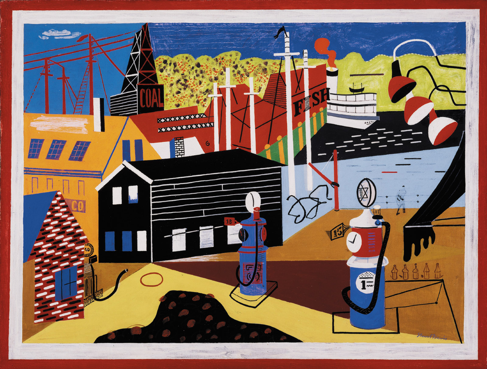
In his day, and perhaps for viewers first coming to him now, Davis—who died in 1964, at seventy-one—was a Cubist of sorts whose special contribution was to give the style an American look. Into his Cubist-type arrangements of so many flat, interlocking shapes he incorporated details that conjured up an American world at its most generic: gasoline pumps and barbershop poles, New York City subway entrances and street lamps, and the masts of boats visible just beyond the warehouses in New England fishing towns. Bringing into his pictures words and phrases—whether from advertising, or a line from a Duke Ellington hit of 1931, or single words such as “now” and “cat” and “else”—Davis brought to Cubism as well an American sound and voice.
A populist and a man who was much given to propounding theories, Davis saw his Americanisms as part of his plan. He was convinced that a modern painter needed to give a sense of his or her time and place and to convey somehow what was novel and urgent about it. He would probably have liked knowing that the last major show of his art in New York, which was at the Metropolitan Museum twenty-five years ago, was called “Stuart Davis: American Painter.”
Yet what makes a larger impression on viewers now, I believe, is less Cubism, which is in itself a far less vital or pressing style for us, or Davis’s American note, which, certainly in his best pictures, is something we don’t take all that seriously. (It helps that he also had a long-running affair with things French, and mixed Paris in with New York.) What counts more is the way that over four decades he kept reimagining, and making more imposing, his art of form and color. Davis stands to the side of painters of his own era, such as Marsden Hartley and Edward Hopper—and of the next, such as Willem de Kooning and Jackson Pollock—in that his work seems hardly touched by psychology, or by any sense of mysteriousness, poignance, or raw tensions. At the same time, for all his evident gifts as a designer of abstract forms, his painting isn’t analytical or measured in spirit.
His pictures convey, rather, a pulsing, muscular human warmth. In his realm of shapes, lines, words, phrases, and glimpses of fire escapes, say, or brick walls, everything appears casual, nonchalant, and handmade. Yet all the elements are also beckoningly sturdy and firm—practically indominable—because they are fixed in place in painted surfaces that, even when they are not literally thick, in memory have the slablike but malleable thickness of cake frosting.
Davis’s most striking thought may have been to make words and phrases, and numbers and dates, parts of his images. It is still a little startling to see how, in still lifes from the early 1920s that include newspapers or commercial products, he was meticulously forthright about painting headlines, brand names, and advertising slogans. Whether or not one feels this is momentous, Davis was essentially formulating (though not single-handedly) Pop art three decades before it happened. (It was a movement that, encountering it when he was in his late sixties, he did not embrace.)
But Davis’s use of words and phrases is livelier and more involving when it touches on his excited response to jazz, or when we can’t fully make out the words (or dates or numbers)—or when they are made-up words (such as “eydeas”) or French words (such as fin and tabac). It is as if the tumble of clunky but spry shapes that constitutes a Davis picture represented his mind, and the letters and words set into the tumble were some combination of memories, specific points, and random nothings. Are there top-flight Davises that have no words or other elements standing for the “real” world? Yes. There are also some Davises in which, overloading the words, he seems to be parodying himself.
What most deeply struck this viewer at the Whitney show, however, was the artist who went about bringing often opposing elements into his scenes at the same moment. Davis was a kind of conservative revolutionary. He was as concerned to insist on, and celebrate, the upheaval in twentieth-century art that was abstraction as he was determined to save, in his work, the world that certain pure forms of abstraction seemed to want to leave out. The result, which Barbara Haskell, in her writing in the Whitney’s catalog, helped me see as never before, was a subtle two-sidedness—and a feeling for multiplicity and simultaneity—running through Davis’s art and thinking. It led him, we realize after a bit, to realign the roles and identities of things.
Advertisement
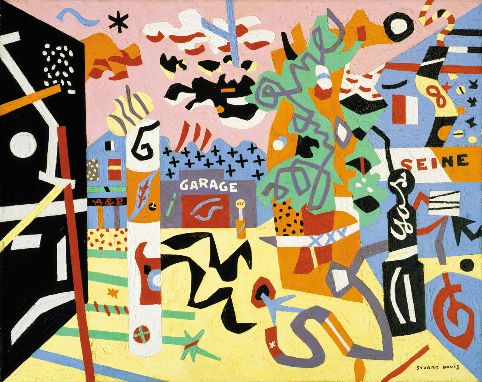
Words, for instance, can be given such prominence—“champion” is a prime example—that the pictures they are in might almost be portraits of them. Davis’s signature is sometimes so large that it has the presence of a subsidiary element in a still life (like a grape wandering off on its own). The 1940 Report from Rockport gives us, anchored among the shapes, the words “garage” and “Seine”—entities that probably only Davis would think of as equals. Here the words become virtually the cast of a two-character play.
Even when handling purely formal aspects of a picture, Davis transforms roles. He will sometimes make lines so widespread and substantial that they could be shapes. Background colors can be so vivid that we lose our sense of what is background and what foreground.
Davis’s individual colors, no matter how much or how little of the canvas they occupy, all somehow come out at us with relatively the same force. Bright, unnuanced, and unencumbered with shadows, his colors are almost the stars of his individual pictures. Yet the titles of Davis’s paintings can be nearly as winning, and his titles, like his words and shapes and signatures, also have the weight of self-contained entities.
His earlier pictures are unremarkable in this regard, but by the 1940s, with Report from Rockport and The Mellow Pad, Davis was seeing titles, it seems, as possessing their own life; and in his last fifteen or so years, his gift for naming took off. Davis titles such as Colonial Cubism, Ready-to-Wear, Cliché, and The Paris Bit have come to seem—to this writer, anyway—like old friends, and I may not be the only viewer who knows these titles but can’t necessarily remember the pictures they go with.
Perhaps other viewers, too, have loved Davis titles such as Tropes de Teens, Blips and Ifs, and the great Owh! in Sao Pão without having any sense of what they might mean (or desire to find out). My favorite probably is Rapt at Rappaport’s, which I confess I long glibly thought might be a Jewish delicatessen version of Report from Rockport. That Davis (both of whose wives were Jewish) was looking for a title with a Jewish ring to it is attested to by the fact that he thought at one point of calling the picture Engrossed at Grossinger’s, after a resort in the Catskills favored by a Jewish clientele. Rappaport’s, however, as Harry Cooper notes in his essay in the show’s catalog, was a toy store at the time that was known for its dotted wrapping paper. Davis recreates a bit of the paper in his image, in itself an abstract conglomeration of forms, and then—he obviously was not the only person to think of this—transposes “wrapped” into “rapt.”
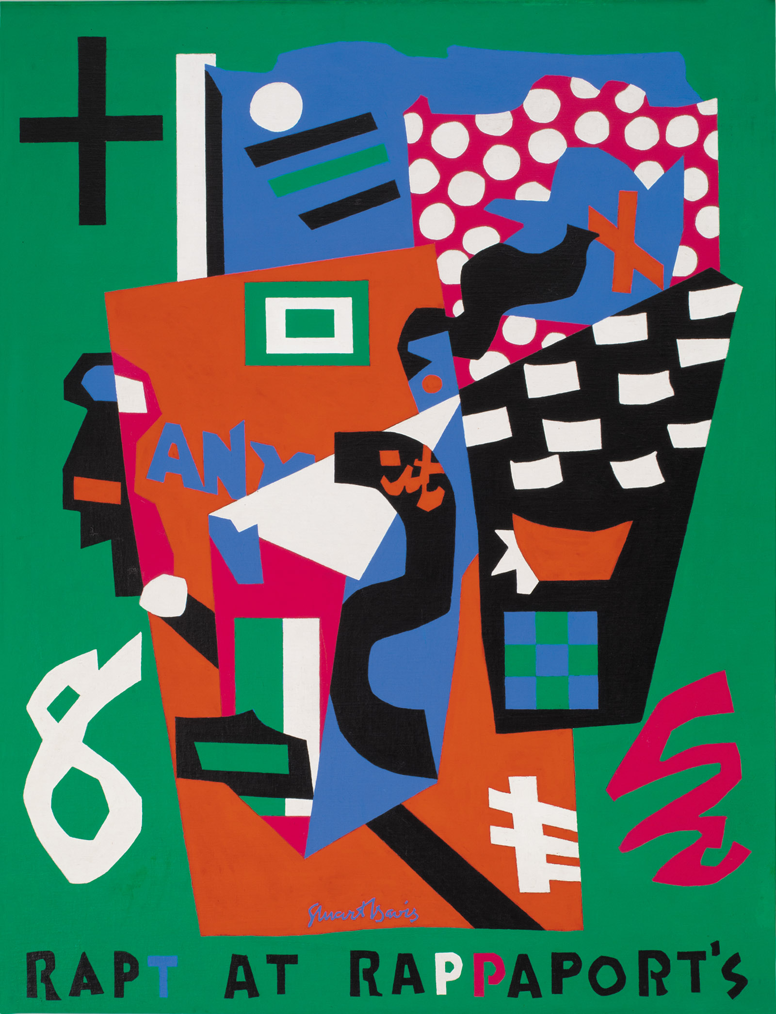
Then he goes further by painting the “T” in “RAPT” in (a rare, receding) blue, while “RAP” is in black. On a quick look, the picture can thus appear to be about a rap, or a talk session, at Rappaport’s as much as it is about both being entranced and wrapping paper. And in having this three-sided life Davis’s title is like his paintings in general, where abstract elements and vestiges of the real world slide in and out of each other.
With its many paintings in combinations of elemental red, yellow, green, black, orange, blue, and white—and pink and lavender—the Whitney’s exhibition is a bit like a toy store itself. The Davis-like subtitle it has been given, “In Full Swing,” lets us know that it is not a retrospective or overall view of the artist. Its organizers have understandably sought to differentiate it from the Met’s 1991 show, which started off with the painter’s early street scenes, landscapes, and self-portraits, done in differing naturalistic styles. The Whitney show begins just after that, with the paintings from the early 1920s of commercial items, made when Davis had first mastered a kind of Cubist language.
Advertisement
To start the show this way certainly gives the assembled works a flowing unity. But there is a slight loss here. Davis actually never had an uncertain, youthful style. His parents were artists, and they somehow went along with his dropping out of school after ninth grade to study art. He had five works in the Armory Show, in 1913, when he was all of twenty, and a few years later, and still a realist of sorts, he made paintings that, like aerial or kaleidoscopic views, present separate, unconnected scenes or settings in one overall scheme. They are his primal works. They let us know that even before he ventured into Cubist waters he was thinking seriously about simultaneity.
At the same time he was also making landscapes and self-portraits that were clearly indebted to Van Gogh. It was the Dutch painter, I believe, with his way of treating the surface of a painting as a matter of so many thrusting, rough-hewn, independent, and handwriting-like brushstrokes, who gave Davis the inspiration for the sort of physical texture, and possibly the emotional texture—as of something earnest and unrelenting—that he wanted for his own canvases. A self-portrait that he did in 1919 that is unmistakably beholden to Van Gogh is a powerhouse work in its own right.
As it is, the first paintings in the current exhibition with the same vibrant strength are not the pictures of tobacco papers and air fresheners that greet you at the beginning. Nor do the second set of pictures in the show—Cubist-type still lifes that have been much admired by commentators and presumably have kitchen utensils in them—have much meaty, contrasty power either. No, it is in a number of Paris street scenes, made from a yearlong stay there beginning in 1928, that Davis finally found a way to have black, white, and a range of colors all play equal parts at once. The Paris pictures, it is true, could be blown up to be wall decorations for a French restaurant or stage backdrops for a musical set in Paris. But with their buildings in buoyant, birthday-party colors, their overall airiness, and their witty use of black lines (what Saul Steinberg would do twenty years later), the pictures hit a note of almost aggressive insouciance that Davis hadn’t revealed before.
He went on to one of his richest paintings: the 1931 House and Street, which many people probably know because it is part of the Whitney’s superlative collection of Davis works. Looking at the picture in light of the importance for him of having different things take place at once, I realized I had not fully seen House and Street before (or fully registered its title). In this urban scene we look at two entirely separate places that have been bluntly conjoined but whose double identity, perhaps because we lose ourselves in the rhythmic placing of blocky forms and popping colors through the two halves, is almost camouflaged over.
But then the Depression, as it did for so many others, took its toll on Davis. There was almost no one buying the progressive art he made, and he was lucky to get commissions for mural projects. Based on examples that are part of the show—including the 1932 mural for the lounge of the men’s room at Radio City—one can feel that these works probably had more life in their original settings than they do here on their own. Most of Davis’s energies in the 1930s, though (as he said himself), went into political activism, chiefly for left-wing groups attempting to safeguard artists’ rights. He was the editor of the magazine Art Front and he early on became president of the American Artists’ Congress.
Participating in these conferences and marches meant that Davis, although he never became a member of the Communist Party, publically tolerated Stalin’s brutalities during the time. But the Soviet invasion of Finland took Davis over the edge. When the Artists’ Congress voted to approve this act, he resigned from it the next day and never returned to organized political causes.
In the 1940s he became, while sticking with the same sense of color and form that he had employed for some time, a transformed figure. As if washing his hands of the political life that had kept him from making many paintings to advance his own art in the previous decade—and seemingly giving up for the moment the idea of creating a public, popular art—he embarked on what would be a small number of not especially large pictures that nominally are of places, whether various parks or lower Seventh Avenue, where his studio was.
As he moved from one picture to the next, however, he put in less sense of the everyday American world. It hardly matters. These mostly horizontal works are packed with exploding nuggets of pointy and curving forms. Looking at the paintings, we are not sure if Davis’s subject is the sheer anarchic profusion of shapes and colors or the opposite: demonstrations of a fanatical control. These are paintings you want to stand before for a long time, maybe none more than Report from Rockport, a vaguely townscape-like scene, crowded with shapes in a space marked by yellow and pink. Feverish and playful, the picture recalls if anyone Joan Miró, Davis’s almost exact contemporary and during these years probably the most innovative painter anywhere.
Then in one of the more remarkable shifts in our art, Davis began making a different kind of painting in the beginning of the 1950s, when he was in his late fifties. In works he continued to paint until his death fourteen years later, words became increasingly important, and his canvas sizes, and the very spirit of the pictures, became bigger. The note of monumentality that Davis achieves in works such as the 1951 Visa, where the word “champion” takes up much of the picture and suggests a flag waving in the wind, may be owed to his efforts as a muralist. But the heroic spirit of these later paintings feels truly new for Davis.
The late, large canvases have generally been considered his best work. The organizers of the show would seem to concur, as there are many of them here—too many. After a dozen or so I found them running together (there are some two dozen on hand), and I began to wonder whether the smaller pictures that preceded them, with their abundance of intricate shapes, weren’t stranger and stronger. It is a good zone of uncertainty in which to find oneself. There aren’t many twentieth-century American painters who have had powerful and distinctly contained phases of work within their art as a whole.
The catalog for the exhibition is a quietly luxuriant affair. The pictures stand out in good, big reproductions, each on its own otherwise empty page. Haskell’s essay on all aspects of Davis’s career lucidly picks up the many strands, and Harry Cooper, writing on the painter’s way of continually reworking his earlier pictures—or making essentially an art about art—presents a Davis who is often lost sight of: an aesthete-engineer who could be entirely oblivious of his time and place. The highlight of the catalog, however, is a book-length chronology—at times going by the month, even the week—that Haskell has compiled. Her “A Chronicle” forms the fullest biography we have of the painter.
Like pictures of his that bring together house and street or Paris and New York, Davis’s life had two distinct sides. Until sometime in the late 1940s, his story was one of grueling stretches of near pennilessness and fruitless fights for recognition. Then quite swiftly there grew an awareness that he was a classic figure. Through both parts we follow his many relations with artists, dealers, and critics, his family life and marriages, and his involvement in politics and with the jazz scene that he followed closely from his earliest days. Threaded through all of it are quotes from letters, reviews, and commentary from many sources but mostly from the high school dropout himself, who published a good number of articles and statements in his lifetime and left over 10,000 pages of writing, mostly about art, in his journals.
Inspired no doubt by her subject, with his belief that in a painting no subject is inherently more meaningful than any other—and his affinity for multifariousness in itself—Haskell keeps the many details, incidents, and quotes, of whatever import, coming to the reader in the same lean, direct way. To start in on this chronicle you probably need to have fallen in love at some time with at least one work by Stuart Davis. Once you have settled into the account, though, you may find it hard to leave off. It held the present writer, well, rapt.