

There’s a Nichols and May routine from the early 1960s about a high-strung worrier of a mother who’s going to the hospital for some tests. Her grown son asks her over the phone what the doctors intend to do. She tells him, “Well, they’ll X-ray my nerves.”
That bit came to mind walking through the exhibition “Terry Winters: Facts and Fictions” at the Drawing Center. In drawing, one feels the nervous system at work. It is where the connections between the hand and the brain, between thought and action, and between action and reaction are made most immediately. Winters is one of the preeminent graphic artists of his, or anyone’s, generation, and the show is by turns mournful, ebullient, mathematical, and sensual.
There are different types of graphic talent at work today: the imagists, like George Condo or Karen Kilimnik, who use line to bring an imagined world to life, and the more abstract mark-makers, like Jasper Johns or Charline von Heyl. And there are those artists who take something from each camp, like Amy Sillman or Joe Bradley. For Winters, his primary allegiance is to the materials of drawing themselves, their ability to record a sensibility. Some artists see and then draw; others, like Winters, draw first, then see. Of course the drawing and the seeing occur almost simultaneously, like instant replay for the hand.
Winters uses marks to build, categorize, extenuate, and react more or less at the same time. His pencil moves at different speeds and degrees of pressure, either with short-span repetitions—back and forth, back and forth—or long and broad arabesques. Often, the gathering up of short, emphatically laid-down strokes, bristling with tensile energy, works in contrast to the outer-directed energy of the exploratory and encircling lines that create a sense of form and impose structure or pictorial cohesion.
Think of a border collie running in a wide loop around a flock of sheep—sometimes a compressed mass, other times scattered in random-seeming clumps. The sheep don’t know they are being herded; the collie knows that it’s doing the herding, but is not thinking about creating form. The sheep and collie can’t have the overview that is provided to the artist. This is one of the central, and I think lovely, paradoxes of art: the artist is both the sheep and the collie, as well as the aerial photographer documenting their interaction from above.
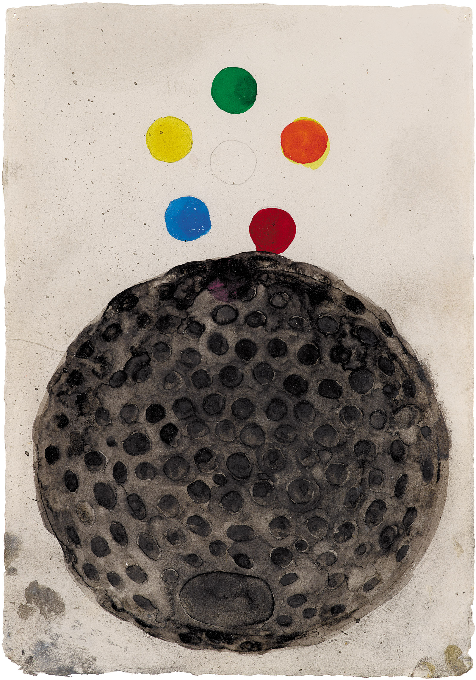
Here are some Terry Winters drawings that illustrate what I mean: Addendum/3 (2014) is an egg made out of smaller eggs, or a fly eye made out of hundreds of seeing cells, all held in a rectangular spiderweb. And the inside of a well or mineshaft seen from above, as the egg form begins its endless descent. The drawing is complicated by some grace notes on the upper-right edge of the form, some escaped hexagonal cells, both clinging to and floating free of the mother ship, or black ball fringe on a mantilla of lace.
Untitled (1) (1999) is a warp or tear in space-time; a dented and ripped window screen, greatly enlarged. Untitled (2014) is a structure of angular, ruled lines, inserting at odd angles, like a collapsing fire escape, seen through a question mark–shaped window.
Although Winters is interested in a range of philosophical and scientific ideas, his more immediate and tactile concern seems to be creating and manipulating visual rhythms. Winters has, in fact, the visual equivalent of musicality, a quality he shares with our prehistoric graphic ancestors and, more recently, with Piet Mondrian, Jackson Pollack, and a few others.
By “musicality” I don’t mean simply that his work is lyrical or lovely, though it often is. I mean that quality we see most clearly in modern choreography: the ability to locate this exact phrase of movement in that precise beat of the score, but in a manner that is often unexpected. The shapes made by bodies in space and the dance phrases that contain them move through the musical line, intersecting with it at key points, while maintaining their independence. It’s rather like the uncanny sensation of being on a train and seeing, through the window, another train on a parallel track; their windows intermittently align as the trains pass each other at different speeds, affording one a fleeting view directly into another car, another parallel life, before, in the next instant, it disappears forever. Or think of the way a lyricist will fit a word or even just a syllable to exactly the right note on the right beat, deepening the meaning of both.
Musicality in art is the functional expression of the overlaps, intersections, pauses, and congruities that occur at specific, meaningful intervals within a fixed or fluctuating tempo. In a drawing by Winters, this can look like clusters of forms aggregated or dispersed across a surface, often according to some principle of organization from the natural world, such as the germination of seeds or mitosis in cells when seen under a microscope. A work may have two or three separate layers of mark-making, of contrasting visual weights, and the ways in which they overlap or intersect can be jumpy and contrapuntal or harmonious and lyrical.
Advertisement
Winters starts from the conventions of “all-over” painting, the dominant type of abstraction in American art since the 1950s, and brings it into the present. He takes the all-over, unitary field of modern painting and overlays it with another set of marks, and then another, and so on. The result, with its laminations, multiple armatures, and composite layers of graphic information, is something that can’t be teased apart; the interweaving is loose yet indivisible.
For example, Untitled (2009) is a mélange of musical notation, ingrown squiggles, flower-petal shapes, William Steig–like clefs, and the gentle warping of the time/space fabric. Winters takes the strings from string theory and makes clotheslines out of them.
A successful drawing is a truce between structure and improvisation. At times the marks look like a record of running thoughts, the mind as a dripping faucet. That’s one layer. Sometimes the marks converge, like snow shaped by wind, into surprisingly familiar images, like constellations of stars. These shapes become silhouettes of namable things: masks, faces, or the bodies of animals. It’s a sensation we’ve all had—seeing the figure in the carpet, the face in the tree bark; abstract shapes brought to a point of recognition. To be effective in the schema of the drawing, these shapes must have a specificity of character, but not be overdetermined; they should feel like something that originates in the drawing’s own DNA.
Winters makes a line that also has a certain character all on its own. These distinctive lines—thick, thin, febrile, agitated, bold, etc., in different materials, pencil, charcoal, ink, crayon, gouache—are often woven into patterns that exploit the expressive potential of intervals, of the spaces between lines or forms as they repeat, shift, expand, contract, or otherwise accumulate and morph. Intervals are the nuclei of pattern and are a fundamental part of any work engaged with rhythm, proportion, and structure.
Every era has its own rhythm, found not only in its music but also in its visual culture, architecture, and technological advances. Winters’s drawings are modern; they convey the lyricism of the concrete. He visualizes the rhythm of information, and his work reflects our obsession with the quantifiable. It’s something of a paradox: Winters, with his beautiful, sensitive hand and graphic refinement, has become a poet of the information age. His work is an adumbration of all the nuanced ways that information is staged, delivered, and understood. He does this without resorting to technical drawing or illustration. One doesn’t need to actually be a techie to create visual metaphors for the ideas that power technology. As an artist friend of mine put it, “I can’t read JavaScript but I can read my e-mails.”
Originality matters differently in painting than in the other arts. The eye is an efficient, if crass, abbreviator, establishing similarity and difference in an instant. For an artist, finding a look or a style that falls within the available possibilities of art, yet is different enough from anything that has come before it, is both the ideal and also a near impossibility. It’s interesting that it still matters so much. Every major style that feels new is at heart an amalgam of originating impulses from previous art, though recombined in ways that obscure them, so thoroughly are they repurposed. It is art’s dimly perceived connection to what came before that allows us to register what is new in it.
When Winters first started to show his work at the beginning of the 1980s, some people, noting the aspect of his technique that emphasized a linear approach to form and the loose placement of those forms around a light-colored ground, as well as a tendency toward an elegant handwriting type of line, thought “Twombly,” as if that settled the matter. Since then, Winters has developed into a kind of artist very different from his apparent precursor, with a different narrative thrust. In any case, we don’t undervalue Peter Handke for his early resemblance to Kafka or Beckett. Quite the opposite, in fact; it’s the obvious connection to the whole Modernist tradition that proves his elevated ambition, his claim to seriousness. Visual art is perverse that way: better an artist should approximate a bum than an aesthete.
Then there is the snobbism of the de-skilled. Everyone understands that in the performing arts talent and extreme skill combine to create something that holds our attention. We don’t imagine that we could conduct the orchestra, except in our fantasies. An artist with a hand as sensitive as a polygraph, however, is politely acknowledged before being condescended to.
Advertisement
One measure of good artists is that what they do looks easy—once they’ve done it. Winters’s line looks so much like what we might imagine an art line to look like that we begin to believe—both the manually inclined and those who have never picked up a piece of charcoal—that we could do it too. Alas, most of us cannot.
For Winters’s graphic output, that somewhat overused metaphor it flowed from his hand is for once exactly right. That flow has been more or less constant, continuously evolving since the late 1970s, and a survey of his drawings puts the focus on the flow itself, the sensation that one is looking at a naturally occurring phenomenon, something with the capacity for endless renewal, or perhaps like a vein of crystals, to which some drawings refer.
The show at the Drawing Center, ably curated by Claire Gilman, restrained though it is by the modest size of the space, is a robust sampling of the last thirty-five years of Winters’s career, with larger works on the walls and smaller, unframed sheets presented in three long vitrines in the middle of the room. The selection shows that Winters’s visual vocabulary has ranged widely over the years, but what impressed me the most is how consistently he has dug down deeply into the nature of his materials to extract from them his broader concerns: for systems, the underlying order of naturally occurring structures, mathematical theory, mapping, topology, and other representations of time and space.
At the start, in the late 1970s and early 1980s, Winters was taken up with images and structural ideas informed by the world of biology, botany, mitosis, cellular structure, and the like. Somewhat as an organism itself evolves, by the late 1980s and early 1990s he shifted his concern to the larger, or smaller, patterns or systems that underlie the natural world and comprise it. He engaged, in the way that a visual artist can, with the ideas of astronomy, physics, and mathematics. It was as if he suddenly looked up, turning his gaze from the pinecone’s helix to the heavens, to celestial evidence of star formation, dispersal, and extinction.
In this later phase of Winters’s drawing, we see the grid loosened, the woof, or the warp, warped. The space in a Winters drawing is very free. Optically speaking, he works with shifting points of view, placing the viewer at various oblique angles to the webs of marks on the surface. Like an open-weave wall hanging taken down and stretched at an angle to the viewer, some drawings provide a worm’s-eye view, looking across a receding plane, and that plane, seen in perspective, might have openings through which can be glimpsed another, differently conceived world of marks. Winters’s drawing hand can do a lot of different things. Dust motes and space dirt. A Milky Way of cosmic dust blown across the sky. Marks spilling down as if through a funnel, or boiling over, or thrust upward like a shower of sparks.
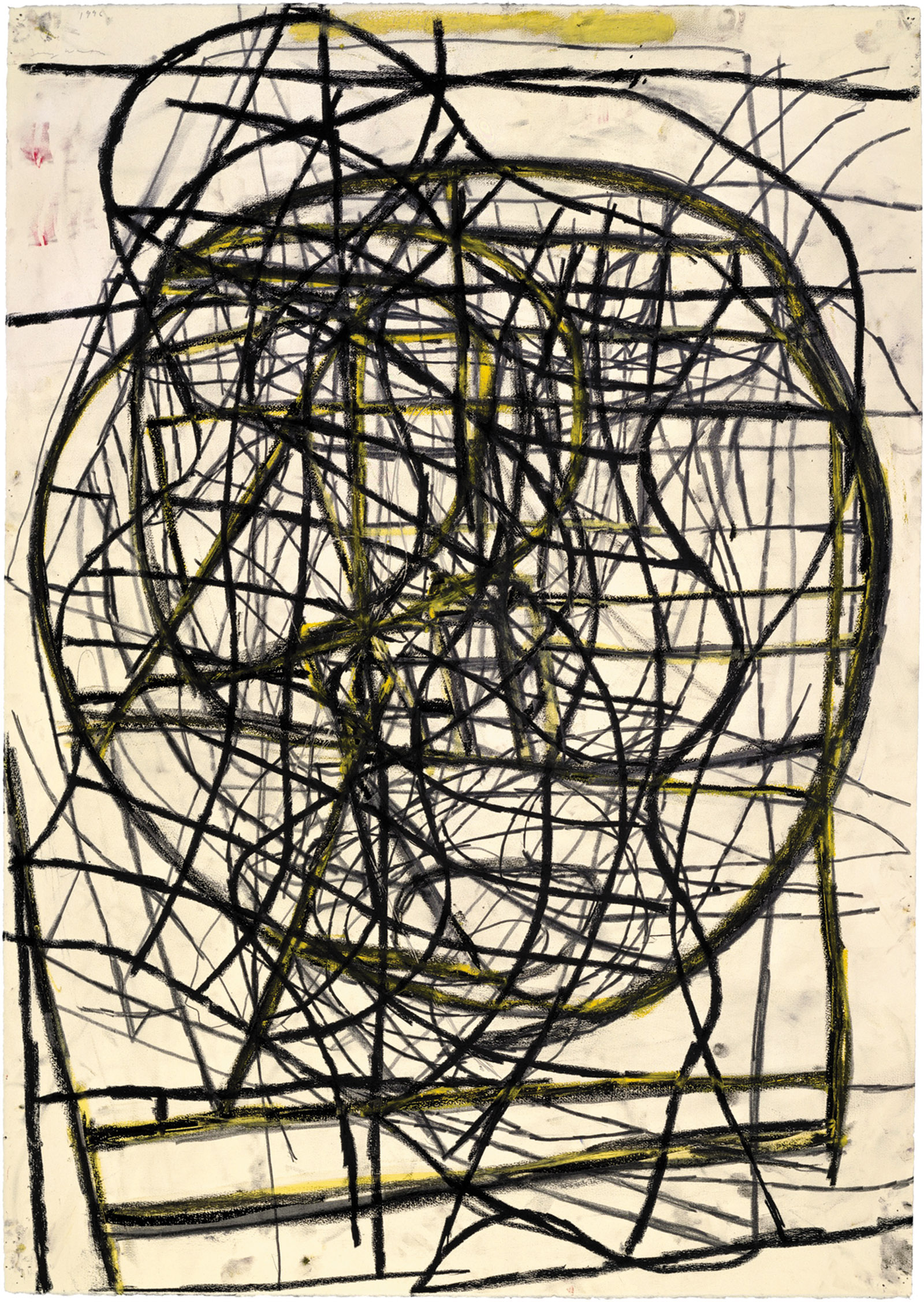
In Animation (1996), for example, we can see the biological and botanical give way to the more purely mathematical or even the intergalactic. Oddly, as they describe more abstract, universal processes, the marks seem to take on more personality. They have greater scale and force, as the bulging interior shapes press against the sides of the paper.
In Thickness)points/2 (2014), as the title has it, thickness is all. Contour is emphasized, exerting great pressure on the interstitial spaces. The shape comes to life, a blackened form becomes a pit bull with alert ears or cartoon horns, outstretched arms and indented eyes, while the underlayer takes on the aspect of an ostrich egg of graphite lines.
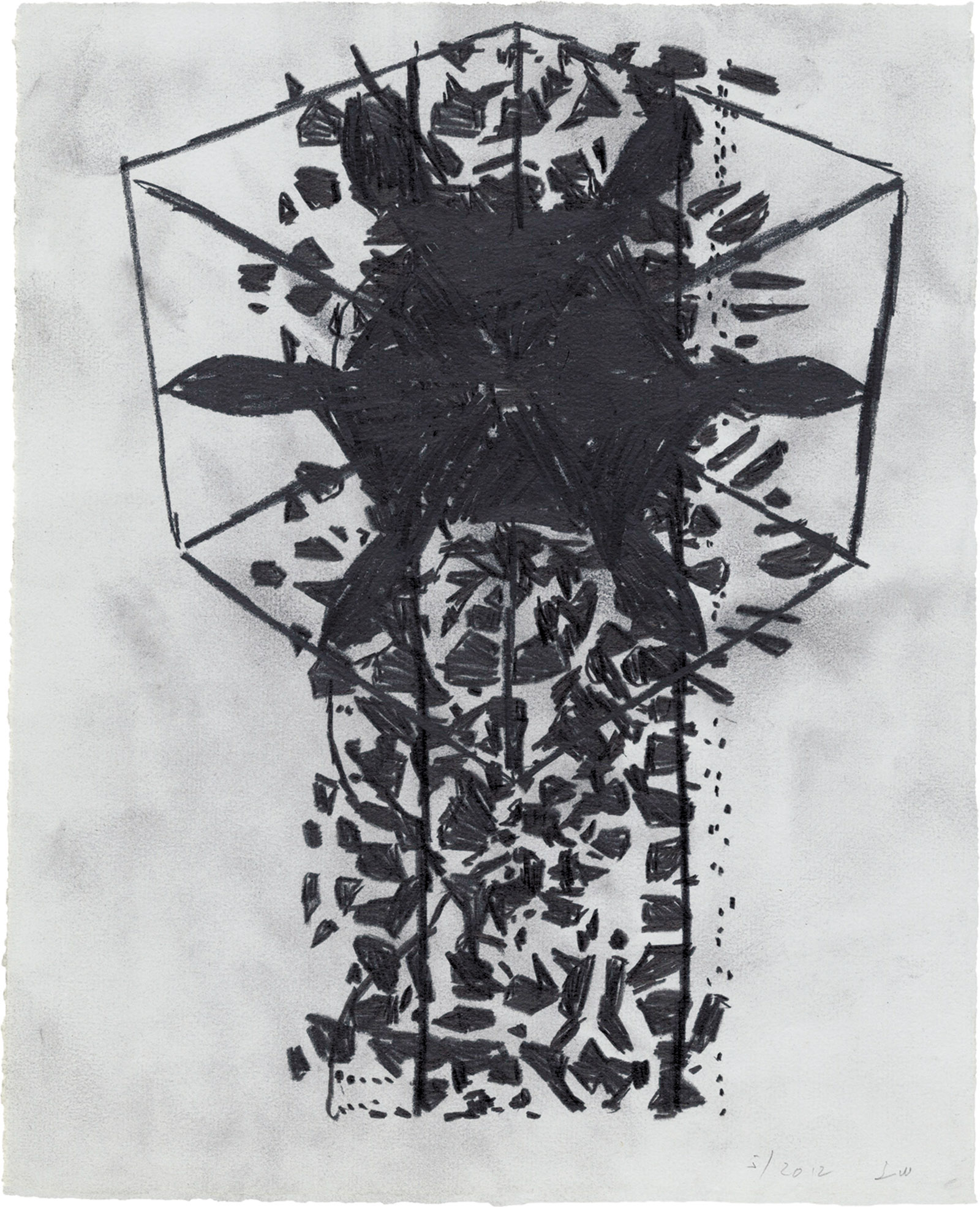
In Ennead/4 (2012), stubby windmill arms are mounted on top of a tower of shards, about to cascade right off the paper onto the floor; the only thing saving it from total collapse is getting the elements to pose for this snapshot.
Winters is extremely witty in person, and his art, though generally sober, reflects a sophisticated, turning-things-inside-out type of humor. Occasionally a drawing will be laugh-out-loud funny. Untitled (2004), for instance, shows an imagined meet-up between Calder’s circus, the mid-century painter Richard Linder, and Plains Indian battle drawings from the nineteenth century. It’s wacky, slightly anxious, and highly animated.
Winters’s drawings show the way that information, systems, grids, etc., turn into an image. It’s a large feeling, one that connects us to the undergirding of the physical world. Some of Winters’s drawings are like watching a cloud, densely packed and shapely, start to break apart and dissolve into cotton candy wisps and finally into nothing at all. They have the timeless appeal, the sense of rightness, of a pair of handmade shoes; justified in their extravagance because of their superior construction, fit, and durability. They’re so comfortable you may forget you have them on; when you look down and see the perfectly shaped toe it quickens your step.
This Issue
August 16, 2018
The ‘Witch Hunters’
The American Nightmare
The Queen of Rue
This Issue
August 16, 2018
The ‘Witch Hunters’
The American Nightmare
The Queen of Rue
