When the Obamas moved into the White House in 2009, one of the artworks they chose to borrow from the various national collections on offer was Ed Ruscha’s painting I Think I’ll… (1983). The title words swim across a streaky, incandescent sky, accompanied by smaller, drifting phrases such as “MAYBE…YES…,” “WAIT A MINUTE…,” “MAYBE…NO…” It was a pretty hip choice for a presidential family—not a landscape, not a portrait, no horse involved. And it was more than that: after the previous eight years of often catastrophic Oval Office decisiveness, the arrival of a heroic painting about dithering felt like an important strategic and moral corrective. It was also, of course, funny.
Such is the winsome heft of Ed Ruscha. Now eighty-five, he has been an art star for six decades, esteemed by critics and enjoyed by audiences in a way that few contemporary artists are. Early paintings like Standard Station, Amarillo, Texas (1963) are globally recognizable avatars of American Pop; his svelte volume Twentysix Gasoline Stations (1963) is credited with having all but invented the field of artists’ books (there were others, but none as influential); and his pictures of words—spilled on surfaces, floating in air, hugging the horizon—have formed the wry and reflective soundtrack of American art for as long as most of us can remember.
Thus it comes as a shock to realize that the grand retrospective now on view at the Museum of Modern Art is Ruscha’s first solo show there. This neglect probably has something to do with regional bias (Ruscha has spent his adult life in Los Angeles) and medium bias (he has dedicated much of his career to working on paper), but it’s also the case that art history has never known quite what to make of him.
Edward Ruscha/Peter Butler/Museum of Modern Art, New York
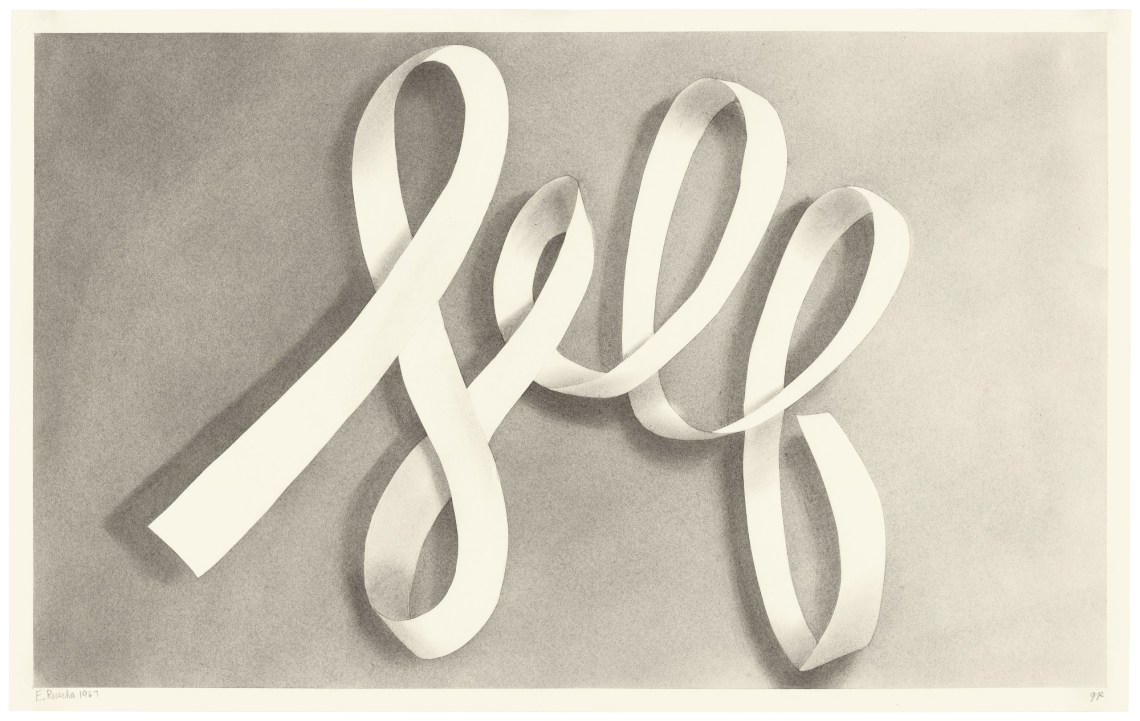
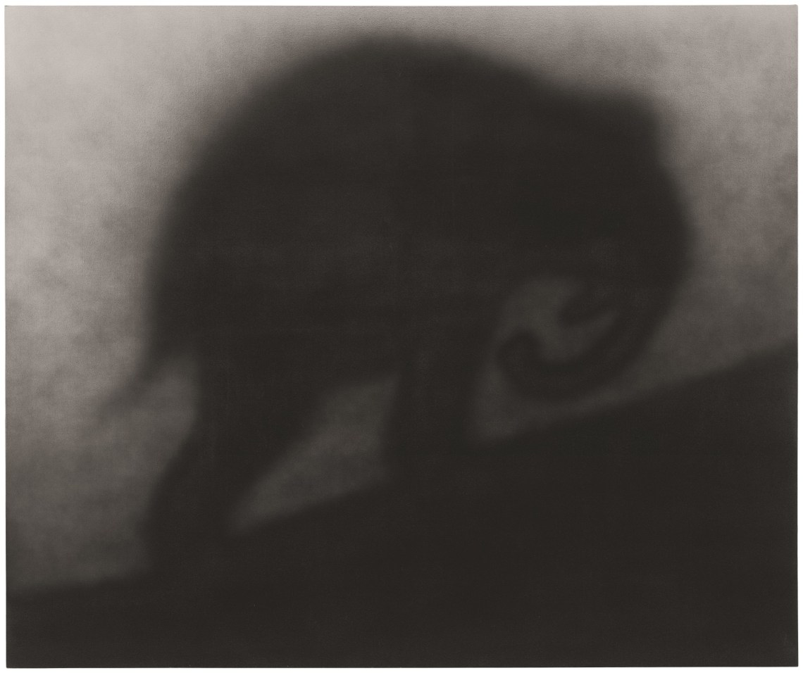
Ed Ruscha: Self, 1967
Edward Ruscha/Museum Associates/LACMA
Ed Ruscha: Actual Size, 1962
Whitney Museum of American Art/Scala/Art Resource, New York
Ed Ruscha: Large Trademark with Eight Spotlights, 1962
Edward Ruscha/Emile Askey/Museum of Modern Art, New York
Ed Ruscha: Jumbo, 1986
Jonathan Dorado
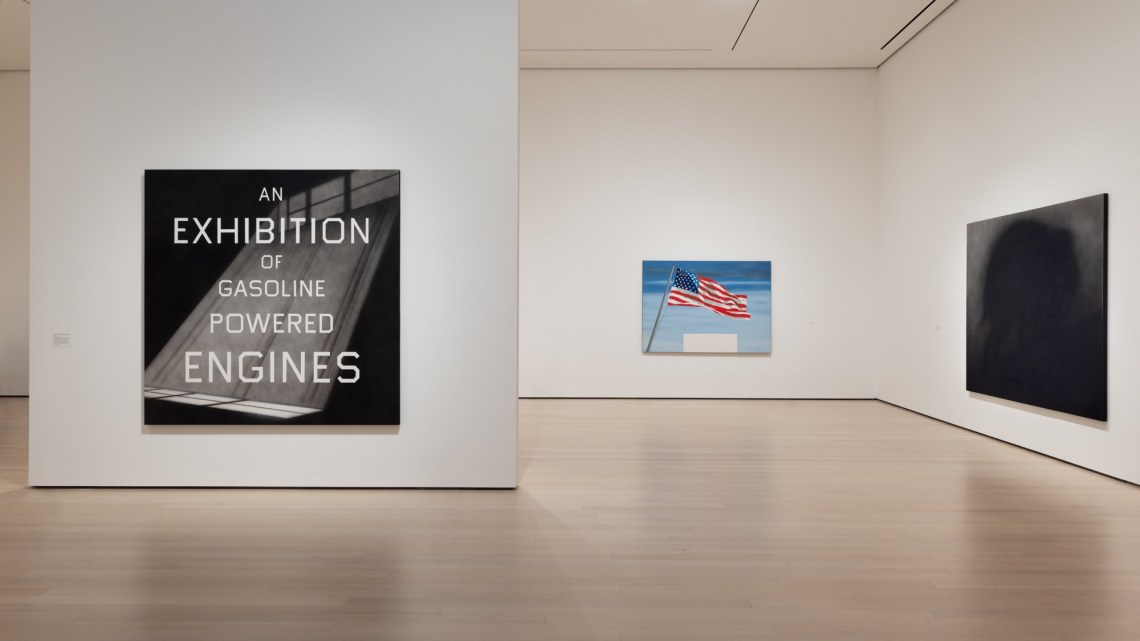
Installation view of ED RUSCHA / NOW THEN at The Museum of Modern Art
Jonathan Dorado
Installation view of ED RUSCHA / NOW THEN at The Museum of Modern Art
“Ed Ruscha: Now Then,” which travels to the Los Angeles County Museum of Art in April, does more than make up for lost time. It provides an unprecedented survey of the artist’s career from school days to the present—paintings, drawings, prints, books, photographs—in a way that is expansive without being exhausting. The installation is beautiful. (Wandering down through the other floors on your way out, you may find the rest of the museum feels jangly and crowded by contrast.) The accompanying catalog is a model of well-ordered information, sharp reproductions, and worthwhile essays. Whether all this comes together to provide a concise sense of what Ruscha is up to, or how he fits into history, is beside the point, because beside the point is Ruscha’s home turf.
One of the earliest works on view is a collage he made while still a student. A bit larger than an LP album cover, it contains a piece of blue-painted wood, what looks like a piece of green picket fence, and some torn bits of a Little Orphan Annie comic. This was 1959, when on-the-fly abstractions with found materials were having their day, but Ruscha’s effort is weirdly formal. There’s a neatly drawn bounding box around his lumpy components, and below them a widely kerned, hand-set letterpress caption: “DUBLIN,”. Since the printing would have come before the gluing, the relationship between image and text is less like an artwork with its title than a mineral identification card with its glued-on specimen. And then there’s that comma, dangling like an untied shoelace off the end of the line. A caption is supposed to wrap things up; this one points offstage to some piece of information either still in abeyance or gone AWOL.
Doubling down on this conundrum, the next year Ruscha painted a portrait of the collage on a six-foot canvas, replicating the blue rectangle, green polygon, tattered Orphan Annie, white space, serif letters, befuddling comma. Retrospectives that span so many decades usually follow a certain arc: skill-building, imitation of admired masters, the finding of a personal voice, maybe a late-in-life fascination with superfluity (think Titian’s brushstrokes or Henry James’s sentences). But here everything fundamental seems to have been in place from the start: the careful attention to design and fabrication; the caption-before-image, tail-wagging-the-dog approach to content; the willingness to let the viewer finish the sentence.
Born in Omaha and raised in Oklahoma City, Ruscha arrived in Los Angeles at eighteen with thoughts, he has said, of becoming a sign painter. At Chouinard Art Institute (now the California Institute of the Arts, or CalArts) he focused on advertising design. He also took classes in painting though found no toehold in the gestural abstraction then dominating the curriculum. A stint with the fine-book printer Plantin Press provided experience in typesetting and letterpress. His road-to-Damascus moment was prompted by encounters with a black-and-white reproduction of Jasper Johns’s Target with Four Faces (1955) in a 1957 article about how contemporary art could inspire graphic designers. Ruscha saw it the other way around—a demonstration that serious art did not have to be improvisational or abstract. You could plan it out in advance. You could use hard edges and straight lines. You could make pictures of things in the world.
Advertisement
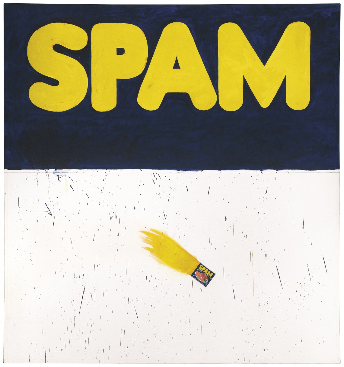
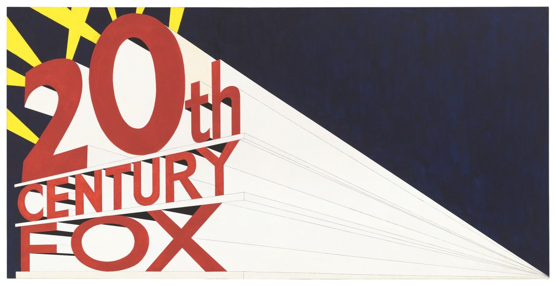
He was also deeply impressed by Robert Frank’s road trip photo book The Americans and the cumulative power of seemingly impartial observations. Carrying a camera on a post-graduation ramble through Europe in 1961, Ruscha recorded shop window displays, signage, and buildings, all with a slightly studied nonchalance. Back in the States he began making paintings that combined brisk words and brand names with pictorial devices. In Actual Size (1962), the upper part of the canvas is filled with the pudgy Spam logo, while a carefully painted tin of Spam flies across the lower part, trailing a fat blast of flame and the penciled notation “ACTUAL SIZE.” In the eleven-foot-long Large Trademark with Eight Spotlights (1962), he extended the already Ozymandian pretensions of the 20th Century Fox logo with a hyperbolic receding diagonal he called the “megaphone effect.”
In 1962 three of his new paintings were included in the Pasadena Museum’s prescient exhibition “New Painting of Common Objects” along with works by Andy Warhol, Roy Lichtenstein, Jim Dine, and Wayne Thiebaud. The Spam picture was acquired by the Los Angeles County Museum of Art. Ruscha was not yet twenty-five and Pop art did not yet have a name, but there was a bright, sassy new spirit in American art, and he seemed to exemplify it.
A few months later he published Twentysix Gasoline Stations—a pocket-size paperback “so curious, and so doomed to oblivion,” a critic wrote in Artforum at the time, “that there is an obligation, of sorts, to document its existence, record its having been here.” The title, marching over the cover in orange varsity-letter type, is a spoiler: inside are twenty-six black-and-white photographs of service stations, each identified by brand and location, all falling somewhere between Los Angeles and Oklahoma City.
It might have been a Robert Frank–influenced social portrait or a beat-era voyage into the nation’s desiccated heartland were it not for the complete absence of human drama and, for that matter, humans. (According to Ruscha, Warhol’s response when given a copy was, “How do you get all these pictures without people in them?”) Ruscha has said he admired the no-nonsense utility of the stations’ prefab structures, but his photos—often blurry, dark, or shot at odd angles—aren’t consistent enough for a study of vernacular architecture. He has said he thought of himself as a reporter, bringing back information about a rural there to an urban here, but it is a report without analysis or conclusion. As for the train-spotter taxonomic precision, he explained: “The title came before I even thought about the pictures. I like the word ‘gasoline’ and I like the specific quality of ‘twenty-six.’”
Compositions that unfold in time—music, novels, jokes—tend to function in similar ways: they establish an expectation, throw in a wrench to disrupt that expectation, then reconfigure the parts in a satisfying yet surprising resolution. The implied road trip premise of Twentysix Gasoline Stations, however, promises a narrative arc that never materializes: we roll from the setup to the end with no perceptible wrench or resolution. The punch line is the absence of a punch line. One sign of how baffling the book was: the Library of Congress refused to accept the copy Ruscha sent in for registration.
The project seemed perverse along almost every axis of production, not least the economic one. “Then and now,” Ellen Lupton and Jennifer Tobias point out in the catalog, “printing a book costs a lot more than making a painting,” and at $3.50 apiece, Twentysix Gasoline Stations seemed to have little chance of making that money back. But a book can do things a painting cannot. It can control the tempo and the reveal of information, limit what is available to the eye at any given moment, and give you something to hold in your hand.
It wasn’t brash, or imposing, or confrontational. Yet it was perfectly calibrated to entice you into looking at the unremarkable: if there had been sixty-two gasoline stations, patience wouldn’t hold; if there were just two, you’d impute that each was special; if he’d hung them as photos on a wall, your eye might glide over them while your mind quickly registered the generic unit “a bunch of gas stations.” In its handheld, one-page-at-a-time, give-it-five-minutes modesty, however, the book gets you to look—not in order to force some particular argument or make some particular appeal to emotion, but simply because looking matters. In its quiet, indirect, elliptical way, Twentysix Gasoline Stations turned out to embody a new job description for the art object, and a new relationship between artist and audience.
Advertisement
In the sixty years since its publication, Twentysix Gasoline Stations has become such a revered landmark—the subject of so many homages, parodies, and impenetrable academic papers—it can be hard to regain a sense of how peculiar and provisional it must have felt at the time. To its great credit, MoMA has made the book accessible to visitors’ hands as well as eyes, suspending a copy from the ceiling with a cable so it can be held and flipped through in all its diffident, disarming glory.
Other books followed, each testing out a different kind of reveal, most retaining the truth-in-advertising titling: Various Small Fires and Milk (1964) includes the artist’s photographs of a butane torch, a cigarette, and other inflammables before its closing glass of milk; Babycakes with Weights (1970) opens with a baby (“15 lbs. 8 oz.”) followed by many kinds of cake. For Every Building on the Sunset Strip (1966), Ruscha mounted a motorized camera on the bed of his pickup truck (Google be not proud) and shot both sides of the two miles of Sunset Boulevard known as the Strip, then arranged the photos in strips along the top and bottom edges of a twenty-five-foot-long accordion-fold leporello.
If Ruscha the painter of trademarks exemplified the stylishness of Pop, Ruscha the maker of perplexing books seemed more in tune with the episodic stylelessness of conceptualism. Indeed, Sol Lewitt’s influential “Paragraphs on Conceptual Art,” published in 1967, reproduced a section of Every Building on the Sunset Strip as an example of art made from a simple prompt followed unswervingly.
Really, though, it was all of a piece. Ruscha’s Pop paintings weren’t just cheeky citations of commercial signage, they were investigations into what pictures do: a word has no natural size, but a tin of Spam does, so what happens when you ask them to share a bed? Large Trademark was a joke about pretentious perspective and also a study in how flat and static things can communicate depth and motion. And while Every Building on the Sunset Strip was certainly conceptual in Lewitt’s sense, one could also see it as an update of Canaletto, replacing the waterborne experience of Venice with the automotive one of cruising for a parking spot in LA. (Ruscha’s book Thirtyfour Parking Lots in Los Angeles appeared the following year.)
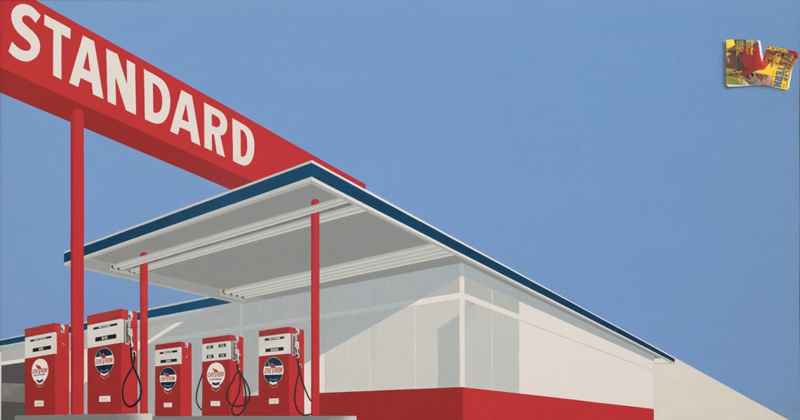
Standard Station, the most enduring Pop image of his career, started life as a photograph taken for Twentysix Gasoline Stations. Applying the megaphone effect to the station’s dour concrete box and cantilevered sign, he made it splendid: perspective lines stretch into the distance, searchlights slice through black sky, and red-coated pumps stand like sentinels below their blazon—“STANDARD”: battle flag of the utterly ordinary. He went on to make many Standard Station variations in different sizes, mediums, and moods.
In one Standard Station painting, the clear blue sky is disrupted by a painted torn magazine that casts a shadow, also painted, on what should be thin air (see illustration at beginning of article). The magazine, a dime Western Ruscha had in the studio, is one of several real-world objects that crop up unexpectedly in otherwise coherent pictures—pencils that seem stuck to canvases, insects moseying about works on paper, that tin of Spam. It’s a Magrittean mind game—you can’t believe in both the sky and the magazine—and “neo-surrealist” got added to the list of Ruscha descriptors.
Excavating the subconscious, however, has never been a Ruscha priority, and anyway this kind of flexing between flat surface and illusion is far older than Surrealism. As Leo Steinberg pointed out, by the Sixties many contemporary artists were approaching pictorial space not as a window to look through but as a “flatbed picture plane” to arrange things on—a development that was “new only in its large, wall-power scale.” “The principle of it,” he wrote, “had always been native to the scriptorial tradition—the practice of illuminated manuscripts, followed by the making of prints.” In other words, what looks like a trippy invention hanging on the wall could well be a natural observation to someone working on a table, where pencils get dropped and houseflies land. Before graphic design went digital, the posture of its practitioners was that of the historical engraver or the medieval scribe.
It is fashionable to discuss Pop art primarily as a critique of consumerism or capitalism, and for some artists that makes sense. But Ruscha’s use of typography, advertising layouts, and lost pencils doesn’t feel like a strategic choice in pursuit of social commentary or like mockery of somebody else’s pleasures. It feels unaffected: an artist using a visual language he understands and enjoys to think about how pictures are put together and what we get out of looking at them. Transliterating that language to paint on canvas at an imposing scale—which he was doing as far back as Dublin,—ensured that a different quality of attention was paid. Even on canvas, though, his reference points are those of printed matter, dictated and conventionalized over the centuries.
It is not an accident that the curators of “Now Then”—Christophe Cherix, Ana Torok, and Kiko Aebi—belong to the museum’s Department of Drawings and Prints, which also used to include illustrated books. Their show moves comfortably between paper and canvas, vertical and horizontal, small and large, singular and series. When Ruscha talks about his work, he is inevitably courtly and pragmatic, happy to discuss the way particular pieces came about, disinclined to make big claims about meaning. “It’s not important for people to see things the way I see things,” he told an interviewer. “I don’t even know how I see things.” The wall labels follow suit, offering helpful information about materials and biographical events, along with occasional quotes from the artist, steering well clear of overweening, interpretive helicopter curating. In the catalog, Lupton and Tobias offer a crash course in the logistics of graphic design production in a predigital world and its implications for how Ruscha’s work developed. Among other valuable observations, they remind us that “printers have always handled words as things.”
No artist has explored the thinginess of words more adroitly or deeply than Ruscha has at every step of his career. In the mid-Sixties he took up a kind of journeyman trompe l’oeil style (not smooth enough to fool the eye, but good enough that you get the idea) to picture typographic letters under pressure (the letters of “RADIO” squeezed with a C-clamp), and then liquids that coalesce into legibility: a puddle of baked beans that can be read as “Adios,” or the word “City” spelled out in clear droplets, its near-perfect circle of a C hinting at an absent highball.
Then there are the ravishing drawings of slips of paper that twist or stand on end to form letters and words that might be suggestive (“SIN” with an unidentifiable dribble at the corner of the S), or confounding (the sublimely beautiful “SCREWS AND EGGS”), or multivalent (“Rustic Pines”—ode to nature? motel? air freshener?). Their ingenuity recalls title sequences from old black-and-white movies, as does the glamorous lighting. Deeper than graphite, softer than charcoal, they have an eerily supple tonality—the result of Ruscha’s chance discovery that soaking gunpowder in water produces a precipitate similar to charcoal but finer, warmer in color, and easier to manipulate. An added benefit: on a wall label the phrase “gunpowder on paper” produces a nice conceptual hiccup between the inference of explosiveness and the foggy calm on view.
Increasingly curious about how other materials might exert meanings of their own, and tired of “putting a skin on a canvas,” Ruscha stepped away from painting in 1969. He made a portfolio called Stains—seventy-five smudges of substances from acetone to Worcestershire sauce, none particularly beautiful and some invisible, but each exactly what it claims to be. He made beautiful gunpowder drawings of levitating sheets of paper stained with blood and Scotch whisky. In London he made a sextet of screenprints using locally sourced words (“Mews,” “Pews,” etc.), which were printed with locally sourced ink substitutes like blackcurrant pie filling and Camp coffee syrup.
The most famous of these adventures occurred at the 1970 Venice Biennale, where the organizers, hoping to defuse protests against American cultural, political, and economic dominance, planned the US Pavilion as a summerlong celebration of collaborative printmaking, international in scope, with a live print workshop and rotating residencies by American art stars. When American forces invaded Cambodia that spring, however, most artists withdrew. Ruscha did not, arguing that artist absenteeism had little effect on foreign policy, and wondering, “What can finally be accomplished by not doing things?” Finding that the workshop was still lacking essential supplies when he arrived, he went to the supermarket and bought tubes of chocolate paste. With the assisting printers, he used it to screenprint hundreds of sheets of paper, which were hung, overlapping like shingles, to cover the gallery walls. It was summer in Venice and there was no air-conditioning, so visitors soon began drawing notes in the soft chocolate; then the bugs arrived. The 1970 Biennale was widely viewed as a debacle, but Chocolate Room became a legend.
Recreated at MoMA in a climate-controlled passageway between two galleries, it lacks the precariousness and interactive glee one imagines was central to the original experience. There is nothing to look at other than matte brown sheets of paper, and yet people slow down, inhale appreciatively, pose for pictures, and lower their voices as if in church.
It is one of Ruscha’s singular qualities as an artist, this ability to start with what looks like flippancy and end with what feels like reverence. Among the drawings encountered just after Chocolate Room is Unidentified Hit Record, where a black vinyl LP hovers like a six-track mandala amid a numinous light show. Another drawing depicts a chicken egg sailing from darkness toward light with a small posse of ball bearings and the serene dignity of an empress.
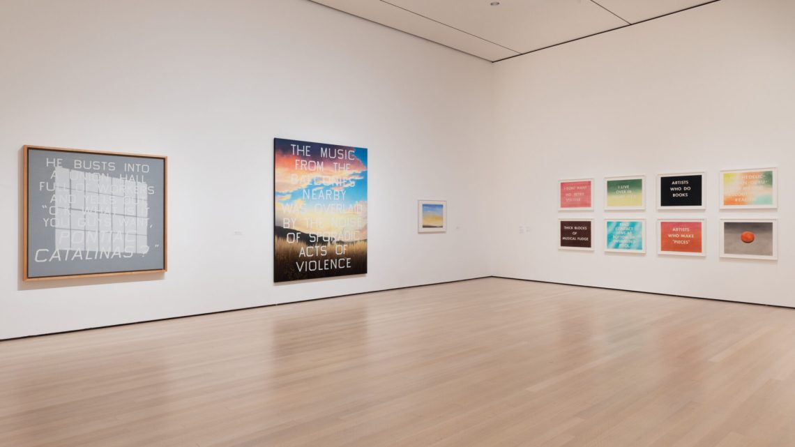
Though Ruscha is still commonly described as a Pop artist, little he has done since the Sixties has much to do with the look of commercial popular culture. And where artists such as Warhol and Lichtenstein spent their later decades feeding new subject matter into their signature Sixties styles, Ruscha has never had one signature style. His pictures of words go from logotypes dressed in native garb to free spirits in fancy dress to teams in uniform. In the 1980s he began using his own typeface (Boy Scout Utility Modern), all angles and corners, like letters made with masking tape or, as he described it, a “clubby, clumsy typeface that looks like it was designed by a phone company lineman.” Isolated words grow into phrases, phrases grow into sentences (“BRAVE MEN RUN IN MY FAMILY”), and sentences grow into scenography (“HE BUSTS INTO A UNION HALL FULL OF WORKERS AND YELLS OUT, ‘O.K. WHAT IS IT YOU GUYS WANT, PONTIAC CATALINAS?’”).
When he returned to painting in the 1970s, he made long, low skyscapes grounded with a rim of topography, like the bottom edge of a planetarium. Words plant themselves in ways that enact plotlines. In the example at MoMA, “AMERICA’S FUTURE” hovers in tiny type just over the horizon behind which the sun has already set. There’s a series called Miracles (beams of light falling from an invisible source), another called Psycho Spaghetti Westerns (detailed scenes of garbage dumped by the road), another called Cityscapes (counterintuitively, benign abstract compositions whose horizontal blocks stand in for the sinister words of the title—for example, 1994’s I’ll Be Getting Out Soon And Haven’t Forgotten Your Testimony Put Me In Here). What is consistent through all this is not a look but an attitude: the interest in the overlooked; the taste for marrying grandeur to understatement; the sneaky profundity; the complete absence of snark.
Color drops away with his Silhouette paintings of the 1980s, in which out-of-focus shadows rise up against smoky backgrounds—an elephant trudging up an incline; clipper ships heeling on a swell; a house at night, its windows aglow—melancholy but cozy in their children’s-adventure-story world. Using the same tool kit, he made campy cinematic memento mori: a sliver of clockface surmounted by a bamboo rod like a skeleton finger; half-frames of a scratched film announcing “The End.” The effect is theatrically menacing yet fundamentally amiable, like a version of D.O.A. directed by Chris Van Allsburg.
Nonetheless, there is a darkening mood that extends beyond midlife crisis (the boy wonder in his forties) to a larger sense of societal decline. The Standard Station makes a reappearance in black and gray, all lights out. A large painting from 1993 is dominated by a dramatic shaft of light—half prayer card, half Fritz Lang—falling from a high factory-style window onto empty floor; white letters overlaying the scene pronounce “AN EXHIBITION OF GASOLINE POWERED ENGINES.” Though there is humor in the juxtaposition, everything about the picture is ghostly: the lighting, the stillness, the salutation to a once sexy, now creaky technology.
Still in this grisaille frame of mind, he made his Blue Collar paintings: ten-foot-long canvases that just skim the tops of blocky, low-slung structures: a trade school, a couple of factories (“TECH-CHEM,” “TOOL & DIE”), a telephone booth, a tire shop. They are beautiful in their way, with nuanced gray surfaces that capture nicely the pluses and minuses of concrete. Several years later, when Ruscha was asked to represent the US at the 2005 Venice Biennale, he returned to the Blue Collar paintings and paired each with a new, colorful update: Tech Chem is now home to Fat Boy, the telephone booth has vanished, the old trade school is perhaps between tenants or in the hands of some opaque corporate entity protecting its intellectual property with reflective windows, a chain-link fence, and barbed wire. Riffing on Thomas Cole’s spectacular painting cycle at the New-York Historical Society, The Course of Empire, Ruscha kept the title minus the article. Cole’s storyline is unambiguous—the landscape passes from primal hunter-gatherers to imperial glory, to destruction and desolation. Ruscha is, as ever, less forthcoming. Is a job at Fat Boy better or worse than one at Tech Chem? We haven’t a clue.
As indicated by the title “Now Then,” one theme of the exhibition is time’s passage, both as the inevitable underpinning of a retrospective and as a subject explicitly addressed in works like Course of Empire. As always with Ruscha, however, syntax matters. The words are back to front, chronologically speaking (the show and catalog both run from then to now), and with no punctuation for guidance they can ring in your head any number of ways: the after-and-before photos in a hair transplant ad, the sighed opening gambit of a disappointed parent, an antique-shop sign missing an ampersand. Or just two temporal markers in uncertain relation.
At MoMA, Blue Collar paintings and their postscripts face off on either side of a vast vitrine filled with books and photographs of Los Angeles. After Every Building on the Sunset Strip, Ruscha had continued documenting that and other thoroughfares for decades, eventually amassing some 750,000 images. (Now at the Getty Research Institute, the archive has been made publicly accessible on a website where you can simulate driving one of his routes in the year of your choice.*)
Looking at these photos is like doing a spot-the-difference puzzle: you’re not just looking at things but between them. It is something Ruscha has been asking us to do since as long ago as Dublin,. About his love of Los Angeles, he explained: “It’s all façades here—that’s what intrigues me…the façadeness of the whole thing.” He is interested, I suspect, less in the façades themselves or in what lies behind them than in the visual and conceptual distance between the two.
Ruscha has described the jolt of leaving Oklahoma (“very slow and simple”) for Los Angeles (“fast and complicated…and also very swanky”). Culturally speaking, the journey was not just from state to state, but also from the Fifties to the Sixties and all that followed, and from the bell curve of middle America to the crazy dumbbell curve of the art world—bohemian dilapidation at one end, pompous glitz at the other, and a long empty stretch between them. The cliché is to say he never looked back, but there’s a difference between looking back and moving back. As “Now Then” makes clear, he’s been looking back and listening ever since.
In the final gallery at MoMA there is a monumental painting of craggy, snow-capped peaks in sidelong light against a dark sky. White letters of Boy Scout Utility Modern announce: “CLARENCE / JONES / 1906–1987 / REALLY KNEW HOW TO SHARPEN KNIVES.” The mountain is a trope, not a location—a stand-in, he says, for “some sort of unobtainable bliss or glory,” and Clarence Jones is a fiction, but “really knew how to sharpen knives” is so plain, so specific, so believable as a source of pride, that the whole combo stops being silly and becomes, for one moment, empyrean.
In 1963, when the Library of Congress rejected Twentysix Gasoline Stations, Ruscha took it as a kind of validation—proof that the book “had an inexplicable thing I was looking for, and that was a kind of ‘Huh?’” That “huh?” may be as close as we get to identifying the engine of Ruscha’s art. Take it as shorthand for something that resonates too actively to be put out of mind; something more persistent than humor and more insinuating than catharsis. “Huh?” does not editorialize. It captures the reality of living in a world we never really do understand. If there is a moral ticking away in this show, maybe it’s this: we will never know the whole story. We are always working with incomplete information. Innuendos R Us.
By the way, the Dublin shout-out in that 1959 collage is to a town in Georgia that Ruscha passed through as a teenager hitchhiking from Oklahoma to Miami—a fact that resolves nothing. Ed Ruscha really knew how to use a comma.
This Issue
November 23, 2023
Inhumane Times
Causes for Despair
This Issue
November 23, 2023
Inhumane Times
Causes for Despair
-
*
12 Sunsets: Exploring Ed Ruscha’s Archive: https://12sunsets.getty.edu. ↩