
In the standard telling, the story of midcentury American art is a saga of hyperbolically talented painters working large and abstractly to manifest an existential encounter between man (notwithstanding the occasional begrudged woman) and material. “What was to go on the canvas was not a picture but an event,” in Harold Rosenberg’s catchy 1952 formulation. Canvas-as-event became a publicity magnet, inspiring popular news items like Life magazine’s 1949 “Jackson Pollock: Is He the Greatest Living Painter in the United States?” along with decades of New Yorker cartoons. On the home front, however, in private houses and apartments, things were different. Rosenberg, in that same essay, noted that “advanced paintings today are not bought by the middle class…. Considering the degree to which it is publicized and feted, vanguard painting is hardly bought at all.”
The disconnect between the art that people choose to acquire in a given moment and the art that later generations find of value is a trope of art history: Van Gogh sold one known painting in his lifetime, Vermeer died bankrupt, and so on. From today’s perspective, though, what is so striking about Rosenberg’s comment is its allusion to middle-class collectors. From the Gilded Age to the Jazz Age, America’s rich had gotten richer, enabling folks like Henry Clay Frick, Isabella Stewart Gardner, and J.P. Morgan to build personal museums (though their aristocrat-manqué hearts belonged to old masters rather than vanguard painters). But then came the Great Depression, World War II, and progressive economic policies that redrew the contours of economic entitlement and with them the shape of the art market. A few months before Rosenberg’s essay appeared in ART news, a Time article on print publisher Reeves Lewenthal closed with the observation “The market for high-priced art is dwindling, he figures, and art’s greatest potential patron is the budget-conscious housewife.”
As subjects of art history, self-destructive geniuses are more seductive than budget-conscious housewives, but lately scholars rummaging about in the art attic have been pushing aside those big, genius-laden canvases to uncover a different, homier story of how American eyes got modern.
“Art for the Millions: American Culture and Politics in the 1930s,” at the Metropolitan Museum of Art last fall, was an engaging survey of stridently egalitarian images and objects produced in America during the Great Depression, from Ben Shahn posters and issues of New Masses to Ruth Reeves textiles and a lovable baby monitor by Isamu Noguchi. The show also charted artists’ embrace of collective action, not just for the working classes but for themselves. Artist agitation contributed to the creation of the WPA’s Federal Art Project (FAP), whose double aim was to provide employment for artists and deliver art to the masses. Its Graphic Art Division paid artists to make lithographs and screen prints—more than 11,000 editions and nearly a quarter-million individual prints over the course of eight years—which were distributed to schools, libraries, and other public institutions. For artists such as Elizabeth Olds, it seemed a first step toward a “drastic reconstitution of the economics of the art market.”
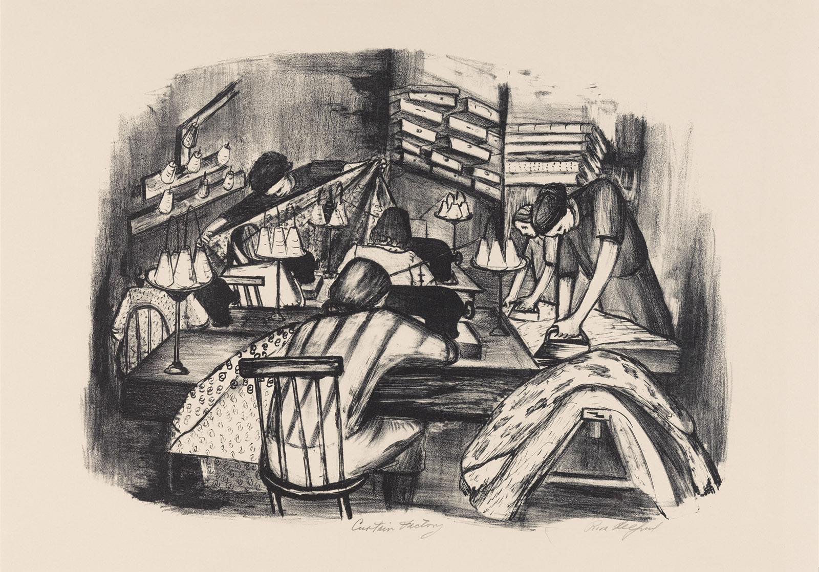
Labor, unsurprisingly, was a popular subject in those FAP prints. At the Met you could see Louis Lozowick’s rail workers spraying cosmic sparks through penumbral fog in Night Repairs (1939); Harry Gottlieb’s Rock Drillers (1939), jackhammering away in bright overalls and porkpie hats (no ear protectors); Harry Sternberg’s riveters in Builders (1935), one with an insouciant cigarette in his mouth, poised on the cantilevered beam of a skyscraper-to-be; the seamstresses in Riva Helfond’s Curtain Factory (circa 1936–1939), locked together with irons and sewing machines in claustrophobic concentration. There were unemployed workers in soup kitchens, striking workers on picket lines, and lots of raised fists, along with more oblique forms of social commentary. One wonders what a school or library would have made of Olds’s Burlesque, with its front row of balding men ogling a chorus line of near-naked girls arranged, the curator Allison Rudnick points out, with the axial precision of an assembly line.
New York City Works Progress Administration
Riva Helfond: Curtain Factory, circa 1936–1939
Meanwhile, the private sector responded to the economic crisis with its own schemes for supporting art and artists. The normally patrician Museum of Modern Art mounted selling exhibitions such as “American Color Prints Under Ten Dollars” (roughly $220 in today’s money) that aimed to “stimulate the public’s interest in buying American art at moderate prices.” This was also the mission pursued, rather more doggedly, by Reeves Lewenthal’s Associated American Artists, whose nearly seventy-year existence was the subject of “Art for Every Home” (2016–2017), a catalog and traveling exhibition organized by Elizabeth G. Seaton for the Marianna Kistler Beach Museum of Art at Kansas State University.
Founded in 1934, AAA commissioned prints by living artists and sold them to middlebrow collectors through department stores and mail order. The prints were “original” (not mechanical reproductions), produced in limited editions, signed and numbered, and priced at five dollars to start with. Its first catalog was titled Bringing American Art to Americans, and national pride was part of the pitch. Farmland, farmers, and American life dominated the early offerings. Grant Wood did twenty-four editions for the organization, Thomas Hart Benton more than fifty. John Steuart Curry’s messianic John Brown lithograph (1939), on view in “Art for the Millions,” was an AAA print.
Advertisement
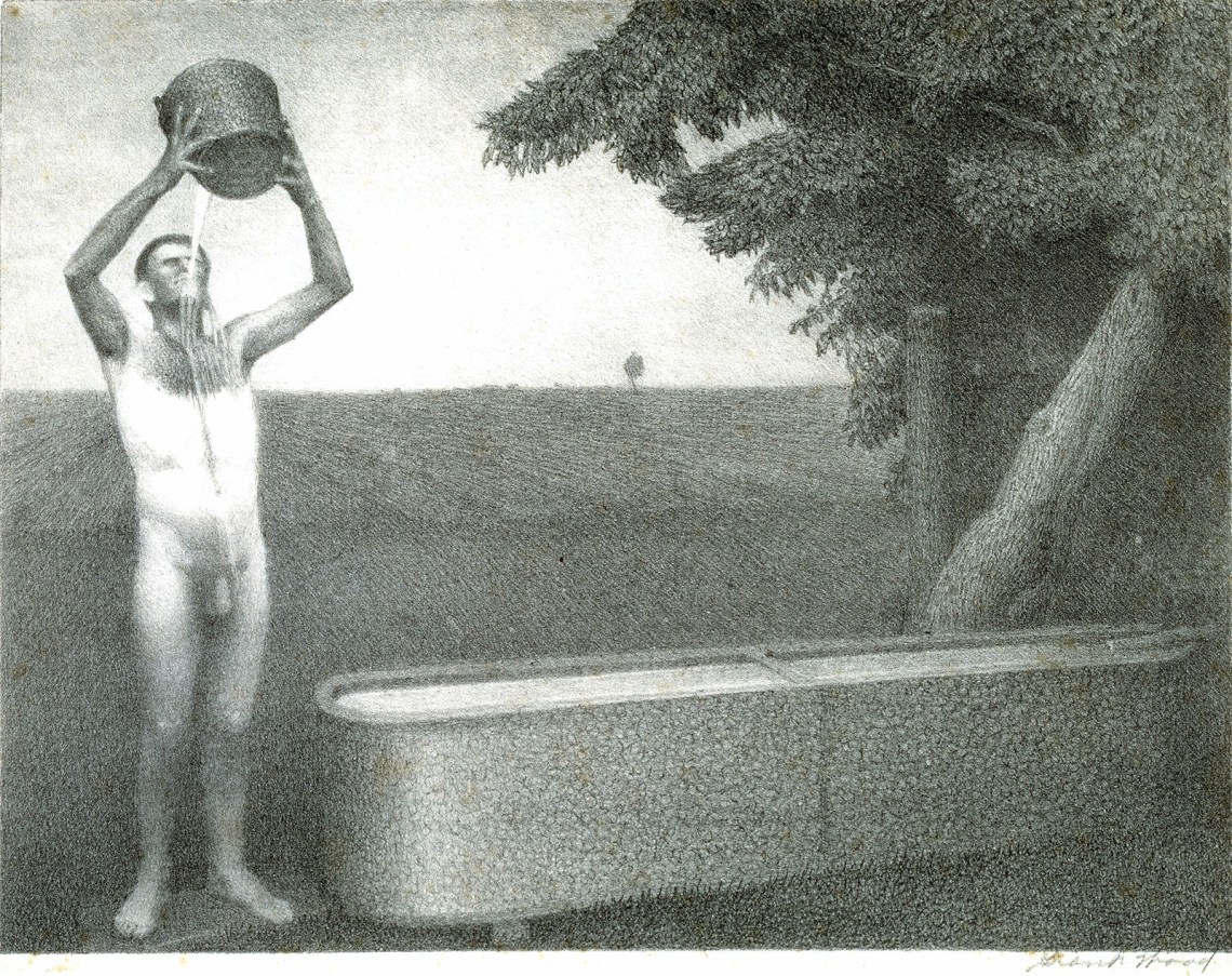
Their subjects were often socially progressive. There were sympathetic pictures of Black people, poor people, and at least one naked person. (Wood’s 1939 Sultry Night featured a full-frontal farmer and could not be sent through the post.) William Gropper and Rockwell Kent, the only two visual artists to be called before the House Un-American Activities Committee, were both AAA artists. Aesthetically, however, AAA art of the Thirties and Forties was conservative: the people looked like people and the landscapes looked like landscapes. There was no hint of the pictorial disruptions that had been remaking European art for a generation: no Cubism, no Surrealism, no abstraction.
Smithsonian American Art Museum
Grant Wood: Sultry Night, 1939
Whitney Museum of American Art
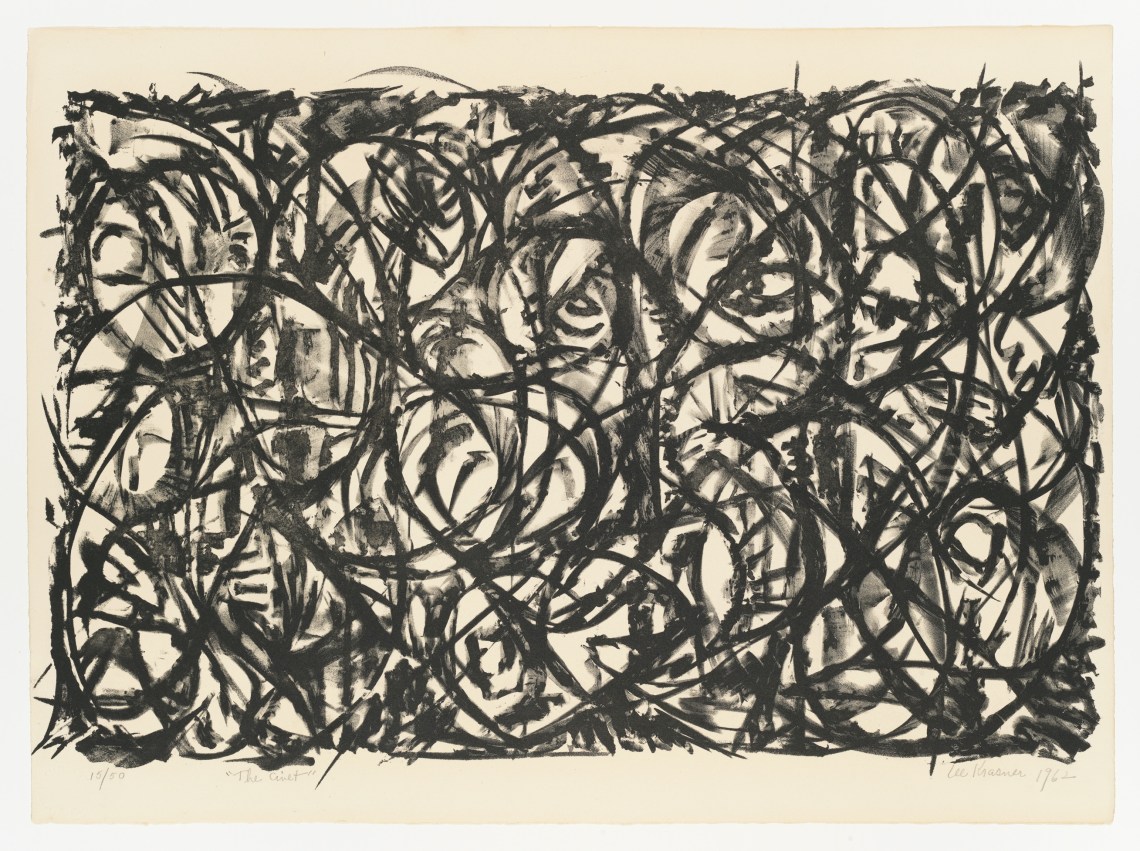
Lee Krasner: The Civet, 1962
Smithsonian American Art Museum
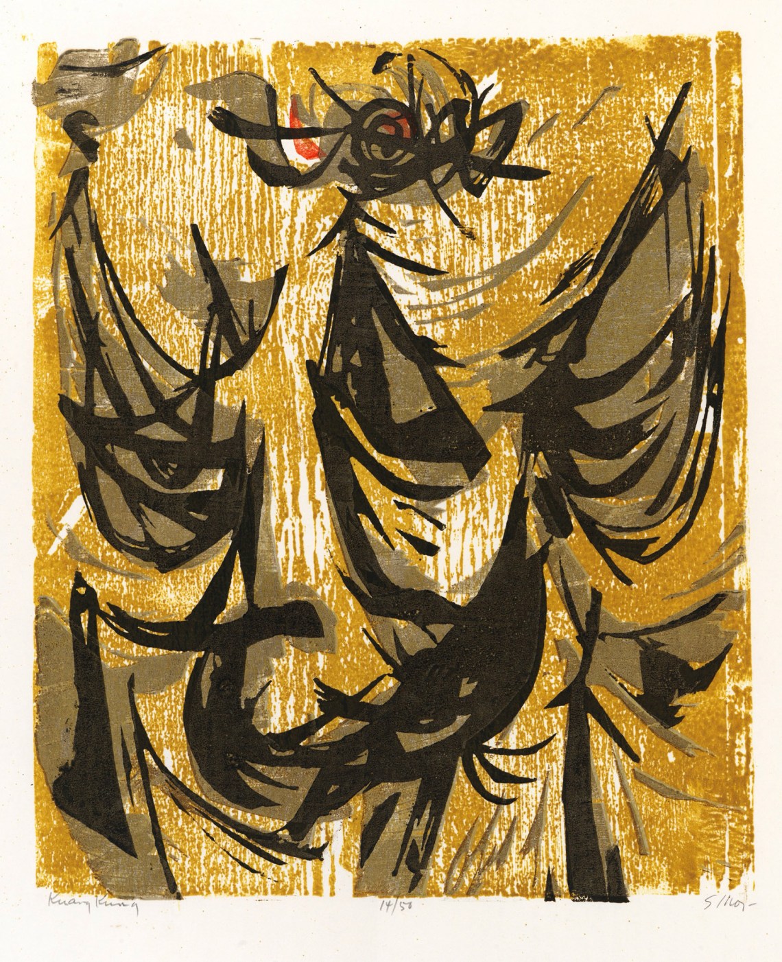
Seong Moy: Kuang Kung, 1952
Cape Ann Museum, Gloucester, Massachusetts
Aino Clarke: Atomic Age, 1943
These were presumably the kind of thing that Mark Rothko and Adolph Gottlieb had in mind when they boasted in a letter to The New York Times that their own work—conceived as “an adventure into an unknown world”—
must insult anyone who is spiritually attuned to interior decoration; pictures for the home; pictures for over the mantel; pictures of the American scene; social pictures;…the Corn Belt Academy; buckeyes; trite tripe; etc.
Thus we get the sense of a midcentury American avant-garde alienated from a progressive middle class and a middle class indifferent to the discoveries of the avant-garde. Was this really the case? Rosenberg was no doubt right that middle-class buyers were not lining up to buy Abstract Expressionist paintings. The average American home measured around a thousand square feet and would have been hard-pressed to accommodate big canvases, regardless of their style or cost.
But the ideal of art as “an adventure into an unknown world” was not the exclusive property of painters or of heroic scale. Printmaking, exploited in the Thirties as an instrument of populist utility, had other attributes: it was full of counterintuitive, hard-to-control processes that might be ideal embarkation points into the unknown. Jackson Pollock was making loop-de-loop engravings with the experimental printmaker Stanley William Hayter years before his drip paintings.
Hayter, a British geologist turned Parisian Surrealist, took the view that every stage in the making of a print, from prepping the materials to inking and printing, was an opportunity for artistic invention and discovery. At the time, most print editions relied on a division of labor: the artist composed the image, then handed the stone or plate off to a professional printer for execution. The goal was efficiency, not experimental mucking about.
Hayter inverted those priorities. For him it was about “what the plate is doing to you and not what you are doing to the plate only.” In exile in New York during World War II, he taught his methods to a range of print-curious artists. Christina Weyl’s The Women of Atelier 17 (2019) details the pros and cons of this tutelage. Inspirational but overbearing, open-minded but dogmatic, Hayter alienated many of the artists who passed through, but the notion of printmaking-as-adventure stuck. By 1956 the Brooklyn Museum curator Una Johnson was noting with pride that
one of the distinguishing features of prints in the United States is that the majority of them are printed by the artist himself and not by a professional craftsman-printer as is so often the case in France.
American prints of the Fifties don’t get a lot of wall time these days in museums and galleries, so “A Model Workshop: Margaret Lowengrund and The Contemporaries” at the Print Center New York last fall was a rare chance to see what Johnson was so excited about. The model workshop in question was a novel hybrid art space—part gallery, part printshop—that opened its doors on Madison Avenue in 1951. Its goal, explained Lowengrund, its founder, was nothing less than “a renaissance of graphic arts in this country.”
Lowengrund understood (as did the leaders of the better-known workshops that followed) that this meant cultivating both artists and buyers. Like Hayter, she was an artist in her own right. Unlike him, she advanced no particular method or aesthetic. The pocket survey of her own work in the show sashayed through various up-to-date idioms: an atmospheric aquatint of Washington Square Park from the Twenties had the picturesque precision of late Whistler or early Edward Steichen, while her lithographs for the FAP valorized workers with muscular grace, and a winter scene painted in Woodstock in the Forties wriggled with Charles Burchfield–esque trees. She called her new space the Contemporaries because even in 1951 “modern” was beginning to feel restrictive.
Advertisement
In the Contemporaries workshop, artists could learn and work with or without assistance, depending on their skills and druthers. Some arrived as technically savvy printmakers, others were painters and sculptors drawn by curiosity. The Print Center exhibition, curated by Weyl and Lauren Rosenblum, included a short 1955 documentary in which the artist Reginald Neal demonstrates the making of a color lithograph, giving an immediate sense of the alchemical attractions and mutability of the process (as well as the cavalier approach to splashing solvents in the vicinity of lit cigarettes). With her gallery, Lowengrund similarly sought to create a program that would be “inflexible as to quality” but “catholic enough to include the works of artists of all schools of expression.”
David Smith made his first lithographs at the Contemporaries in 1952, using the stone much as he did paper in his drawings, as a space for squiggled notations like alien runes. One that was on view at the Print Center, however, incorporates a second stone with pale blue smears that give the squiggles curious heft, less like writing and more like tools on a pegboard. Also in the show was a Lee Krasner lithograph, a fraction the size of her canvases but organized through the same taut line dancing along the edge of chaos. In an early Corita Kent screen print, a storm of gestural color all but conceals the figures of the Virgin and Gabriel—a non-serene Annunciation where alarm and elation are present in equal measure.
This was cutting-edge art on a domestic scale, and it was affordable. Lowengrund established a print-of-the-month program, with prices capped at fifty dollars (less than six hundred dollars today)—more than AAA’s prices in the Thirties, but the editions were smaller and the nation was now richer. It was a trial marriage between the new ideals of art and the old goal of bringing artists and middle-class audiences together. And it almost worked.
The title of Elena M. Sarni’s book Trailblazing Women Printmakers: Virginia Lee Burton Demetrios and the Folly Cove Designers is unfortunate. The subjects were not printmakers by any definition used in the art world, they were not exclusively women, and it’s hard to know what “trailblazing” means when applied to a collective producing hand-blocked fabrics (a technique thousands of years old) in the middle of the twentieth century. But pay no mind—it is worth learning about them because their creations were almost uniformly delightful and raise useful questions about where we set fuzzy edges between art and design, gallery and living room.
The organization owed its existence to Virginia Lee Burton, best remembered today as the author and illustrator of the children’s classics Mike Mulligan and His Steam Shovel (1939) and The Little House (1943). Soon after moving to the hamlet of Folly Cove, on Cape Ann, Massachusetts, with her young family in the Thirties, Burton began giving neighborhood classes in linocut printing on fabric. Linocut is inexpensive and easy to master, especially if, like the first Folly Cove members, you forgo a press and print your blocks by jumping on them (a ridiculous-looking exercise recorded in both photographs and fabric patterns). Linocut’s atavistic simplicity—one step up from potato prints—encouraged a lean clarity. By 1941 she had a formally established collective with a membership that included trained and amateur artists, trailing spouses, and local housewives.
Burton’s children’s books use modernist visuals—geometric blocks and gradients, dynamic space, compressed action—in the service of cozy sentimentality. The love interest in Mike Mulligan is an obsolete machine in danger of being scrapped; the protagonist of The Little House is a superannuated building encroached upon by urban life. Both get happy endings, where past and present coexist amiably. The fabric designs and table linens that came out of Folly Cove had a similar character: witty and charismatic, with a distinctive blend of aesthetic refinement and aw-shucks folksiness.
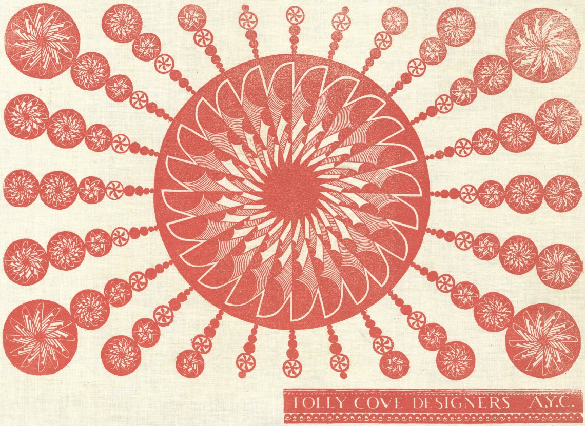
All motifs were drawn from life, a rule that fostered rural and regional subjects: seagulls, cranberry bogs, Queen Anne’s lace, lots of mice and chickens. But while these people lived in the country, it was still the twentieth century: women wear trousers, people drive cars. One pattern by Lee Natti shows black-and-white chickadees perched on pine branches that might have been sculpted by Harry Bertoia, while Aino Clarke’s streamlined people toweling off in a sauna would not have been out of place in the Art Deco splendor of Rockefeller Center. (Finnish names and habits were a legacy of immigrants recruited to work the local granite quarries.) Burton, the storyteller, condensed whole narratives into pattern with ingenious visual economy: one follows a prizefight from boastful flexing to a double knockout while the crowd leans left, then right, then erupts in cheers. In another, we watch a woman doing calisthenics get slimmer frame by frame, with each stage partitioned by an ornamental measuring tape.
Sold through craft outlets like America House in New York, by mail order, and from a barn on the property Burton owned with her husband, George Demetrios, Folly Cove’s products found a ready audience. Far from being an outlier, their blend of rusticity and sophistication reflected the sensibilities of an art world that warmed to both modern painting and historical American crafts. One of the gems in “Art for the Millions” was Charles Sheeler’s 1931 painting Americana, which took lessons learned in Paris when Cubism was on the boil and applied them to a ladder-back chair, a trestle table, and a Shaker box. In 1932 MoMA, definitionally the museum of modernism, mounted a major exhibition of eighteenth- and nineteenth-century American folk art. (Its curator, Holger Cahill, would go on to head the FAP.) Photographs show the apartment of the Whitney Museum’s first director, Juliana Force, stocked with Cubist still lifes, folk art portraits, and dangling eagles upcycled from old weather vanes.
In 1945 the design-forward head of Lord and Taylor, Dorothy Shaver, solicited Folly Cove designs for a run of commercially printed fabrics. The store’s street-level windows were dedicated to a celebration of the group. An article appeared in The New York Times (“Designs with an American Accent”) and another story ran in Life. Other partnerships followed: F. Schumacher and Co. commissioned fabrics and wallpapers; the Edwin M. Knowles China Company wanted dishware designs; Rich’s department store in Atlanta requested Georgia-themed patterns and shipped local plant life to Massachusetts for study.
Everyone was aware of the postwar boom in new homes, which needed new objects to fill them. AAA expanded its print business to include artist-designed glassware, ceramics, wallpaper, and fabric, including a repeating pattern adaptation of Grant Wood’s twenty-year-old painting The Midnight Ride of Paul Revere. Around the time William Gropper was called before HUAC, his winsome design “Spring Rain” came out as fabric.
The Contemporaries too saw opportunity: in the catalog for “A Model Workshop,” the design historian Sarah Archer chronicles Lowengrund’s pursuit of advertising directors, decorators, and architects as vectors for art distribution; she even mooted a service whereby artworks might be commissioned or adapted for specific settings, in different sizes and, “provided the artist is amenable,” different colors. In 1953, art from the Contemporaries was used to lend cultural élan to model apartments in a new high-rise in Riverdale, in the Bronx. The promotional publicity, Archer notes, credited the gallery “as a ‘source,’ akin to the creator of hand-blocked wallpaper or upholstery fabric, but the individual artists who made the prints in question are not identified.”
Most art is bought as decoration—destined not for museum walls or climate-controlled free-port storage but for hallways, offices, and that maligned space over the mantel. But to describe a piece of modern art as decorative is generally taken to belittle it, to cast suspicions of complacency, of aesthetic or even moral laziness. Rothko, Gottlieb, and most artists at the Contemporaries would have agreed about this: good art is not there to charm or placate; it is there to unsettle. The point of the event-on-canvas (or litho stone, or etching plate) was not, they believed, the solution it represented but its enactment of the insoluble problem of human existence.
The catch, as Mary McCarthy pointed out in a 1959 issue of Partisan Review, was this: once an object leaves the studio, its unsettledness begins to settle. Eventually that gestural event becomes “just as much an art-object as the piece of driftwood on the coffee table or the seashell on the Victorian whatnot…. The truth is, you cannot hang an event on the wall, only a picture.” And a mere picture was just a hop, skip, and a jump from becoming a “profit-commodity” ready for exploitation by “fashion designers, educators, and wallpaper firms.”
You could watch this process unfold in “A Model Workshop.” For all the fine works of art on view, and for all the individual struggles of creation they invoked, the show had a visible repetitive cadence—this was part of why it looked so great on the wall. Step back and you saw the same shapes pop up over and over. They were there in Seong Moy’s Kuang Kung (1952) woodcut of a standing figure, in Gabor Peterdi’s landscape etching The Swamp #2 (1954), in Edward Millman’s skittish Laughing Bug (1952), in the abstract lithograph Reginald Neal makes in his film. You know these shapes: the spiky tangles like snippets of barbed wire, the razor-edged polygons, that off-kilter pointy-ended sling—the Nike swoosh of midcentury angst. It is the look of the Fifties. Everything—animal, vegetable, or mineral—looks like it could put your eye out, but soften that swoosh a bit and you’ve got boomerang Formica.
Folly Cove designs are not diminished by this event-to-picture-to-decoration progression, since they never pretended to be other than decoration. The closest thing to images of struggle reproduced in the book is a trio of tight linocuts showing work in the quarry. Made by one of the group’s few male participants, Eino Natti, and printed on paper, they would not have been out of place in “Art for the Millions.” But in an unfinished how-to book about the Folly Cove method, Burton speaks to her imagined reader, someone who “wants to decorate her home…and express herself in her curtains or dresses or table linen.” This was not the expression of Elizabeth Olds or Lee Krasner. It was expression as an antidote to, rather than an investigation of, the difficulties of life. Folly Cove designs are so winning because they have a twentieth-century aesthetic without any twentieth-century anxiety. Even the pinwheel-mandala design titled “Atomic Age” is cheery.
The question McCarthy left unasked was: What’s wrong with wallpaper? When Keats wrote “Beauty is truth, truth beauty,” he was, after all, talking about a vase, and reformers from William Morris onward pushed the ideal of the home as a work of art, capable of expressing ethics as well as beauty, a kind of feng shui political tract you could sleep in. Early-twentieth-century avant-gardists had made a point of appropriating mass-market decorative arts: Picasso, Braque, and Gris stuck printed oilcloth and wallpaper on their paintings and collages; Man Ray had fun with flat irons. Duchamp’s readymades made clear the power of the viewing eye and mind in reconstituting found objects as art. (McCarthy’s driftwood on the coffee table might be seen as the readymades’ Zen offspring.)
In 1948, when Life convened a roundtable discussion on modern art (“fifteen distinguished critics and connoisseurs undertake to clarify the strange art of today”), Aldous Huxley (with possible snark) compared Pollock’s drip painting Cathedral (1947) to wallpaper, arguing that it could repeat indefinitely around the room, while Sir Leigh Ashton, the director of the UK’s foremost design museum, observed that the same painting “would make a most enchanting printed silk.” He wasn’t wrong. But everyone knows you pay a different kind of attention to a painting.
The “drastic reconstitution of the economics of the art market” that Elizabeth Olds looked forward to in the Thirties never came to pass. The FAP closed down in 1943, and art production reverted to private enterprise. Lowengrund probably did change the course of contemporary art, laying the groundwork for the American “print boom” that arrived with Pop Art, but in the Fifties her profit margins were too low and Manhattan rents too high to be sustainable; shortly before her death in 1957, the Contemporaries was adopted by Pratt Institute and reemerged as Pratt Graphics Center. And while that 1950s moment of William Gropper wallpaper may have been the stuff of Partisan Review nightmares, it proved unremunerative. The budget-conscious housewife turned out not to be art’s greatest patron after all.
The Folly Cove Designers, meanwhile, found they preferred the pace and self-determination that came from producing their own small-batch goods. They wound down their commercial involvements before finally disbanding in 1969, soon after Burton’s death. Anyway, in the Sixties the whole cycle McCarthy described had gone from being art’s predicament to being its acknowledged subject. AAA adapted. Selling David Hockney prints in the Sixties and Christo prints in the Seventies, it trundled on until 2000—undone in the end by Reaganomics and the return of a plutocratic art market.
Seventy years after Rosenberg it is still the case that “advanced paintings” are not bought by the middle class, but it is no longer true that they are “hardly bought at all.” Instead, vanguard art is the Bitcoin of palpable objects—a place to park stupidly large amounts of money while keeping speculative fingers crossed. And the middle classes? Well, now there’s Etsy for etchings and linocuts in the high two figures, and the museum gift shop, where you can buy modestly priced authorized reproductions of Rothko paintings, scaled down to fit nicely over the mantel.